Entity Manager
The entity-management micro front-end provides a seamless way to interact with back-end resources, enabling users to manage entities directly from the front-end.
It features two core components: a grid for displaying and managing entity data and a form for creating or updating entities.
Below are some of the capabilities that streamline entity interaction and enhance user experience:
-
Event Handlers:
- Configure Create, Edit, and Delete events for seamless resource management.
- Buttons are added to the grid automatically, so that users can create, edit, or delete records.
-
Automatically generated forms:
- Forms are dynamically generated from the back-end resource metadata.
- Simplifies the process of creating or updating entities.
-
Approval workflow support:
- Supports proactive and reactive approval-message flows for events that require additional justification.
- Allows custom labeling of the approval message prompt.
-
Dynamic grid configuration:
- Displays entities as rows with attributes in columns for a clear and structured overview.
- Integrates with back-end data sources, such as Data Server queries or Request Server requests to populate data dynamically.
-
Streamlined workflow:
- Combines the grid and form seamlessly to provide quick navigation between viewing, creating, and editing entities.
- Uses pre-built components to reduce development time.
-
Custom actions:
- Extend functionality beyond standard CRUD operations with custom buttons and actions.
- Trigger backend events or execute client-side callbacks with flexible positioning options.
- Support form-based actions with default value mapping from selected row data.
-
Configurable error notifications:
- Lets you control the notification surface used for submit failures (for example, snackbar or toast).
- Uses the same config for optimistic concurrency warnings and other submit errors.
Adding the Entity Management component to the template
Below is a simple example of how to configure the Entity Management component. This example demonstrates not only the basic setup but also how the component interacts with back-end resources, showing the grid and the form for creating new records. The configuration is straightforward, allowing for quick integration into your template.
- Genesis
- React
- Angular
Declaration:
<entity-management></entity-management>
Usage:
@customElement({
  name: 'entity-management-example',
  template: html`
   <entity-management
      design-system-prefix="rapid"
      resourceName="ALL_COUNTERPARTYS"
      title="Counterparty Management"
      createEvent="EVENT_COUNTERPARTY_INSERT"
    ></entity-management>
  `,
})
export class EntityManagementExample extends GenesisElement {}
Declaration:
<entity-management></entity-management>
Usage:
export default function EntityManagementExample({}) {
  return (
   <entity-management
      design-system-prefix="rapid"
      resourceName="ALL_COUNTERPARTYS"
      title="Counterparty Management"
      createEvent="EVENT_COUNTERPARTY_INSERT"
    ></entity-management>
  );
}
Declaration
<entity-management></entity-management>
Usage
import { Component, CUSTOM_ELEMENTS_SCHEMA } from '@angular/core';
import { FormsModule } from '@angular/forms';

@Component({
  selector: 'my-root',
  template: `
   <entity-management
      design-system-prefix="rapid"
      resourceName="ALL_COUNTERPARTYS"
      title="Counterparty Management"
      createEvent="EVENT_COUNTERPARTY_INSERT"
    ></entity-management>
  `,
  standalone: true,
  schemas: [CUSTOM_ELEMENTS_SCHEMA],
  imports: [FormsModule],
})
export class AppComponent {}
The following example is based on the following kotlin code snippets.
In your app-name-tables-dictionary.kts add:
tables {
  table(name = "COUNTERPARTY", id = 11_001) {
    field("COUNTERPARTY_ID", STRING).sequence("CP")
    field("COUNTERPARTY_LEI", STRING(100)).metadata {
      maxLength = 100
      minLength = 0
    }
    field("ENABLED", BOOLEAN).default(false).notNull()
    field("NAME", STRING(100)).notNull().metadata {
      maxLength = 100
      minLength = 0
    }
    primaryKey("COUNTERPARTY_ID")
  }
}
In your app-name-dataserver.kts add:
  query("ALL_COUNTERPARTYS", COUNTERPARTY) {
    fields {
      COUNTERPARTY_ID
      COUNTERPARTY_LEI
      ENABLED
      NAME
    }
  }
In this example, the following attributes are used to configure the entity-management micro front-end:
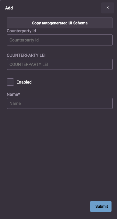
design-system-prefix="rapid"ensures that all UI elements are styled according to the rapid design system.resourceName="ALL_COUNTERPARTYS"defines the source of the data for the grid: a Data Server query calledALL_COUNTERPARTYS.title="Counterparty Management"displays "Counterparty Management" as the title of the grid.createEvent="EVENT_COUNTERPARTY_INSERT"automatically generates a form with all the fields from the metadata of theEVENT_COUNTERPARTY_INSERTevent. The form includes and adds a button at the top of the grid so that the user can access this form to create new entities.
With these attributes in place, you can run the application locally. If the back-end resources are correctly configured, the grid will be displayed on your page.
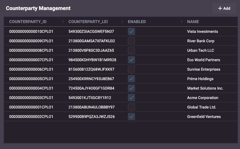
And you can click on the Add button to view the form.
Example: counterparty management
Below is a simple example of how to configure the Entity Management component to enable users to add, modify and delete details of counterparties. This example demonstrates not only the basic set-up but also how the component interacts with back-end resources, showing the grid and the form for creating new records. The configuration is straightforward, allowing for quick integration into your template.
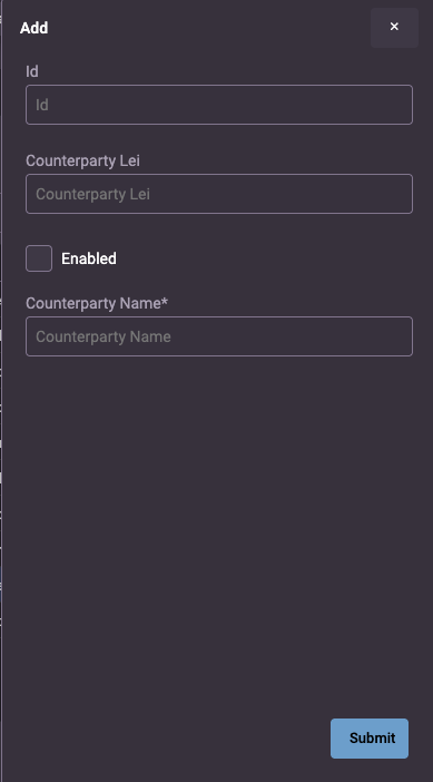
The example uses a separate schema to design the form for creating a new counterparty. However, the default (automatically generated) form is used for modifying existing counterparties.
- Genesis
- React
- Angular
Declaration:
<entity-management></entity-management>
Usage:
const counterpartyUIschema = {
  type: 'VerticalLayout',
  elements: [
    { type: 'Control', scope: '#/properties/COUNTERPARTY_ID', label: 'Id' },
    {
      type: 'Control',
      label: 'Counterparty Lei',
      scope: '#/properties/COUNTERPARTY_LEI',
    },
    { type: 'Control', scope: '#/properties/ENABLED', label: 'Enabled' },
    { type: 'Control', scope: '#/properties/NAME', label: 'Counterparty Name' },
  ],
};

@customElement({
  name: 'entity-management-example',
  template: html`
   <entity-management
        enable-search-bar
        design-system-prefix="rapid"
        resourceName="ALL_COUNTERPARTYS"
        title="Counterparty Management"
        :createFormUiSchema=${(x) => counterpartyUIschema}
        updateEvent="EVENT_COUNTERPARTY_MODIFY"
        deleteEvent="EVENT_COUNTERPARTY_DELETE"
        createEvent="EVENT_COUNTERPARTY_INSERT"
    ></entity-management>
  `,
})
export class EntityManagementExample extends GenesisElement {}
Declaration:
<entity-management></entity-management>
Usage:
const counterpartyUIschema = {
  type: 'VerticalLayout',
  elements: [
    { type: 'Control', scope: '#/properties/COUNTERPARTY_ID', label: 'Id' },
    {
      type: 'Control',
      label: 'Counterparty Lei',
      scope: '#/properties/COUNTERPARTY_LEI',
    },
    { type: 'Control', scope: '#/properties/ENABLED', label: 'Enabled' },
    { type: 'Control', scope: '#/properties/NAME', label: 'Counterparty Name' },
  ],
};

export default function EntityManagementExample({}) {
  return (
   <entity-management
        enable-search-bar
        design-system-prefix="rapid"
        resourceName="ALL_COUNTERPARTYS"
        title="Counterparty Management"
        createFormUiSchema={{counterpartyUIschema}}
        updateEvent="EVENT_COUNTERPARTY_MODIFY"
        deleteEvent="EVENT_COUNTERPARTY_DELETE"
        createEvent="EVENT_COUNTERPARTY_INSERT"
    ></entity-management>
  );
}
Declaration
<entity-management></entity-management>
Usage
import { Component, CUSTOM_ELEMENTS_SCHEMA } from '@angular/core';
import { FormsModule } from '@angular/forms';

const counterpartyUIschema: UiSchema = {
  type: 'VerticalLayout',
  elements: [
    { type: 'Control', scope: '#/properties/COUNTERPARTY_ID', label: 'Id' },
    {
      type: 'Control',
      label: 'Counterparty Lei',
      scope: '#/properties/COUNTERPARTY_LEI',
    },
    { type: 'Control', scope: '#/properties/ENABLED', label: 'Enabled' },
    { type: 'Control', scope: '#/properties/NAME', label: 'Counterparty Name' },
  ],
};

@Component({
  selector: 'my-root',
  template: `
   <entity-management
      enable-search-bar
      design-system-prefix="rapid"
      resourceName="ALL_COUNTERPARTYS"
      title="Counterparty Management"
      [createFormUiSchema]="createUISchema"
      updateEvent="EVENT_COUNTERPARTY_MODIFY"
      deleteEvent="EVENT_COUNTERPARTY_DELETE"
      createEvent="EVENT_COUNTERPARTY_INSERT"
    ></entity-management>
  `,
  standalone: true,
  schemas: [CUSTOM_ELEMENTS_SCHEMA],
  imports: [FormsModule],
})
export class AppComponent {
  createUISchema = counterpartyUIschema
}
In this example, the following attributes are used to configure the entity-management micro front-end:
design-system-prefix="rapid"ensures that all UI elements are styled according to the rapid design system.resourceName="ALL_COUNTERPARTYS"defines the source of the data for the grid: a Data Server query calledALL_COUNTERPARTYS.title="Counterparty Management"displays "Counterparty Management" as the title of the grid.:createFormUiSchema=${(x) => counterpartyUIschema}specifies the UI schema for the create form. It dynamically loads the schema for the counterparty form from a predefined JavaScript object or function, ensuring that the form fields align with the data structure of the entity.updateEvent="EVENT_COUNTERPARTY_UPDATE"defines the event used for updating existing entities (counterparties). This displays the form and fills it with the data of the selected entity (counterparty) for editing.deleteEvent="EVENT_COUNTERPARTY_DELETE"defines the event used for deleting counterparty records. A button will be displayed for users to delete the selected entity (counterparty) from the grid.createEvent="EVENT_COUNTERPARTY_INSERT"by default, this automatically generates a form with all the fields from the metadata of theEVENT_COUNTERPARTY_INSERTevent. However, we have separately created a schema for the create form in this example (identified bycreateFormUiSchema). This attribute also adds a button at the top of the grid so that the user can access the form to create new entities (counterparties).enable-search-bardisplays a functioning search bar in the grid, so that users can search for specific entities (counterparties).
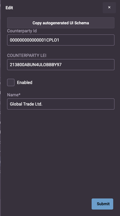
With these attributes in place, you can run the application locally. If the back-end resources are correctly configured, the grid will be displayed on your page.
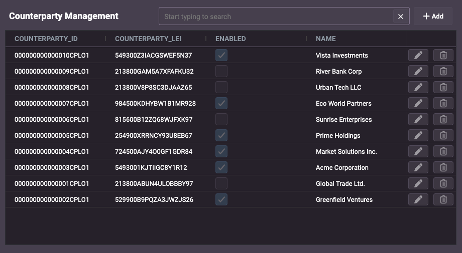
And you can click on the Add or Edit button to view/edit the form.
Common attributes & properties
The most common attributes and properties you can configure for entity-management are listed below.
| Attribute | Description | Mandatory |
|---|---|---|
title | customizes the title of the entity list so that the user can see what resource they are managing. | Yes |
resourceName | specifies the name of a resource on the server: a query in the Data Server, a ReqRep in the Request Server. | Yes |
createEvent | specifies an event on the back end for adding a record to the table; once specified, this displays an Add button above the grid. | No |
set-approval-message | enables proactive approval workflow in create/update forms by adding APPROVAL_MESSAGE to the form schema and sending it alongside DETAILS. | No |
approval-message-label | customizes the label used for the approval message field in the approval dialog. | No |
updateEvent | specifies an event on the back end for modifying a record in the table; once specified, this displays an Edit button to the right of every record in the grid. | No |
deleteEvent | specifies an event on the back end for deleting a record in the table; once specified, this displays a Delete button to the right of every record in the grid. | No |
persist-column-state-key | the user can change columns (the width, for example); if you want the changed column states to be persisted when the user navigates away from the page, specify a unique string value. By default, changes are not persisted, and the grid returns to its default state every time the user navigates away from it. | No |
crud-menu-position | specifies the position of the CRUD action buttons (Add, Edit, Delete) within the grid. Possible values are: column, top, bottom, none (no menu displayed) | No |
crud-menu-style | defines the visual style of the CRUD action buttons. Possible values are default (displays the buttons side by side), actions-vertical (displays a small button with three vertical dots; when the user clicks on this small button, the available CRUD options are displayed vertically), actions-horizontal (displays a small button with three vertical dots; when the user clicks on this small button, the available CRUD buttons are displayed horizontally) | No |
crud-action-menu-name | defines the label used for the CRUD action menu. | No |
Note that it is not mandatory to specify an event, but if you don't specify a createEvent or an updateEvent, then you won't have a form created - which defeats the point of using this micro front-end. It would be simpler to use a grid-pro or grid-tabulator.
The persist-column-state-key string defines the key where the serialised state of the columns is stored, as an object in local storage.
If you set multiple entity-management components in your application, you must use unique keys to persist the state - otherwise, the user experience will be unpredictable.
| Property | Description | Mandatory |
|---|---|---|
datasourceConfig | configures the interaction with the back-end resource. | No |
defaultEntityValues | an object that contains default values to populate the form when the user is adding an entity. | No |
columns | enables you to supply an array of ColDef[] properties to customise the grid. | No |
createFormUiSchema | enables you to supply a schema to configure an insert form. | No |
updateFormUiSchema | enables you to supply a schema to configure an update form. | No |
errorNotificationConfig | configures how submit failures are displayed (for example, snackbar/toast) while preserving the default message content. | No |
customActions | an array of custom actions that extend entity management functionality beyond standard CRUD operations. | No |
For a full list of attributes and properties with examples, see the Entity Manager declarative HTML or API documents.