Grid configuration
The Grid is a key component of the Entity Management, enabling you to display and manage data from back-end resources. It offers a flexible, structured layout where each row represents an entity, and each column represents an attribute of that entity. The grid can be easily configured to retrieve data from designated back-end resources and is automatically populated and updated to reflect changes in the underlying data source.
This section explains how to configure and customize the grid to suit your application's needs.
Grid columns
If you want to control the appearance of the grid, use the columns attribute. This enables you to supply an array of ColDef[] properties to configure the columns that are displayed, their width and many other properties; these are the same properties that are used by the Grid Pro component.
The example array below creates six columns, specifying the width of each one.
- The
fieldis the field in the data source. - The
headerNameis the text displayed in the column heading. - Three of the fields use
cellStyleto control the alignment of the values displayed. - One field (whose column heading is "Status") also uses
cellStyleto control the colour of the values displayed.
const columnDefs: ColDef[] = [
  { field: 'COUNTERPARTY_ID', headerName: 'Counterparty ID' },
  { field: 'NAME', headerName: 'Name', cellStyle: { 'text-align': 'right', color: 'red' } },
  { field: 'ENABLED', headerName: 'Enabled', width: 100 },
  { field: 'COUNTERPARTY_LEI', headerName: 'LEI' },
];

@customElement({
  name: 'entity-management-example',
  template: html`
   <entity-management
      design-system-prefix="rapid"
      resourceName="ALL_COUNTERPARTYS"
      title="Counterparty Management"
      updateEvent="EVENT_COUNTERPARTY_MODIFY"
      deleteEvent="EVENT_COUNTERPARTY_DELETE"
      createEvent="EVENT_COUNTERPARTY_INSERT"
      :columns=${() => columnDefs}
    ></entity-management>
  `,
})
export class EntityManagementColumns extends GenesisElement {}
As a result of these column definitions, the following grid is displayed:

CRUD menu
By default, the grid displays Add, Edit and Delete buttons to match the settings you have made for createEvent (insert), updateEvent (edit) and deleteEvent. These are placed above the grid to the right. Edit and Delete buttons are greyed out until the user selects a row in the grid.
You can set the location of the buttons using the setting crud-menu-position.
- To position the Edit and Delete buttons in a column for every row in the grid, set
crud-menu-position = column.
- If you don't want to display the buttons at all, set
crud-menu-position = none.
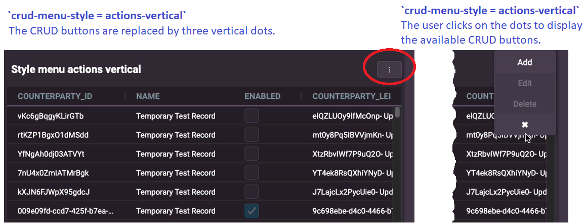
You can set the style of the buttons using the crud-menu-style setting. This hides the buttons and displays a small button with three vertical dots. When the user clicks on the three dots, the available buttons are then displayed for the user to select.
- With
crud-menu-style = actions-horizontal, when the user clicks on the dots, the buttons are displayed horizontally (side-by-side). - With
crud-menu-style = actions-vertical, when the user clicks on the dots, the buttons are displayed vertically.
CRUD slots
A slot is essentially a placeholder where you can define content and actions for a component - such as menu buttons. The slots are generated dynamically, based on the value of the crud-menu-position attribute.
Static slots
| Name | Description |
|---|---|
header | The content to be displayed in the header section. If crud-menu-position is set to top, this slot content will overwrite the crud-top content. |
footer | The content to be displayed in the footer section. If crud-menu-position is set to bottom, this slot content will overwrite the crud-bottom content. |
Dynamic slots
You can set the crud-menu-position attribute to one of the following values: column, top, bottom, action.
Based on this value, the following slots will be available:
| Name | Description |
|---|---|
crud-{position}-before | The content to be displayed before the specified position |
crud-{position} | The main content for the specified position |
crud-{position}-after | The content to be displayed after the specified position |
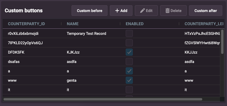
In this example, we demonstrate how to customize the position of the CRUD action menu within the Entity Manager by setting the crud-menu-position attribute to top.
<entity-management
  design-system-prefix="rapid"
  crud-menu-position="top"
  resourceName="ALL_COUNTERPARTYS"
  title="Custom buttons"
  updateEvent="EVENT_COUNTERPARTY_MODIFY"
  deleteEvent="EVENT_COUNTERPARTY_DELETE"
  createEvent="EVENT_COUNTERPARTY_INSERT"
>
  <rapid-button slot="crud-top-before">Custom before</rapid-button>
  <rapid-button slot="crud-top-after">Custom after</rapid-button>
</entity-management>

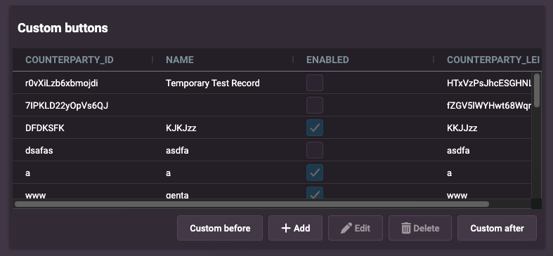
In this example, we demonstrate how to customize the position of the CRUD action menu within the Entity Manager by setting the crud-menu-position attribute to bottom.
<entity-management
  design-system-prefix="rapid"
  crud-menu-position="bottom"
  resourceName="ALL_COUNTERPARTYS"
  title="Custom buttons"
  updateEvent="EVENT_COUNTERPARTY_MODIFY"
  deleteEvent="EVENT_COUNTERPARTY_DELETE"
  createEvent="EVENT_COUNTERPARTY_INSERT"
>
  <rapid-button slot="crud-bottom-before">Custom before</rapid-button>
  <rapid-button slot="crud-bottom-after">Custom after</rapid-button>
</entity-management>

- If you create multiple slots of content or actions, the slots will be placed side by side.
- Ensure that the
crud-menu-positionis set appropriately to avoid conflicts with theheaderandfooterslots. - The dynamic slots (
crud-{position}-before,crud-{position},crud-{position}-after) are generated inside theheaderandfooterslots. Therefore, if theheaderorfooterslots contain content, they will overwrite the dynamic slots.
Default behaviour
- The default value for
crud-menu-positioniscolumn. - If
crud-menu-positionis set tobottomand thefooterslot is also set inentity-management, thefooterslot content will overwrite thecrud-bottomcontent. - Similarly, if
crud-menu-positionis set totopand theheaderslot is also set inentity-management, theheaderslot content will overwrite thecrud-topcontent.
Downloading data
You can enable .csv file exports on any entity manager component via its properties. To enable this feature with the default values you configure the property with a function that returns an empty object.
<entity-management
  :enableCsvExport="${() => ({})}"
>
</entity-management>
The reason for returning an object is you can choose to configure that object to override the default values. For example:
<entity-management
  :enableCsvExport="${() => ({buttonName: 'Download', fileName: 'counterparty-export'})}"
>
</entity-management>
The default button name is Export and the filename is export.csv. Once the feature is enables a button will be shown on the entity manager which will download the .csv file of the data when clicked.