Design system configurator
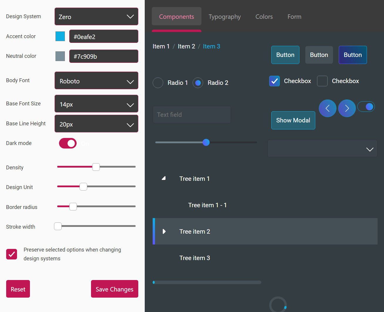
The Design System Configurator is a tool that enables you to configure many of the CSS variables that the rapid design system uses. You can adjust settings by moving sliders and changing values, and see the effect of the changes immediately on screen.
To run the Design System Configurator:
If you have created your app via Genesis Create or genx:
-
Go to the
/clientdirectory. -
Run:
npm run dsconfig
If you are using IntelliJ or another IDE, simply run that npm job.
Working with the configurator
On the left-hand side, is the Editor. On the right side, you can see the Preview with the results of those changes.
When you make changes in the Editor panel, you can see the effect immediately in the Preview. It's as simple as that.
Click on the button above to start the configurator now. This includes more example design systems. You can switch between systems, make adjustments and save the resulting design tokens in a JSON file.
When using the DSC on your application, it configures the rapid design system, which is the default. You can also use this to configure yor own design
system, as long as it uses the same tokens.
Editor
The Preserve selected options... checkbox in the editor is ticked by default.
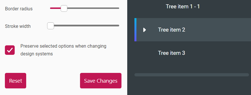
This setting means that any adjustments you make are retained if you switch between design systems. For instance, if you change the Accent Color while on the Rapid design system, and then you switch to Zero, you will see the changes you made there as well.
If you untick this setting, your adjustments are not changed when you switch between design systems. When you switch, the adjustments are reset to the default.
In this documentation, the DSC (Design System Configurator), is in preview mode rather than application mode. There are minor but significant differences between them.
The Design System is an important configuration. The Design System you choose control the look of the whole application. If you choose a different system, you will get a different look.
Preview mode and application mode
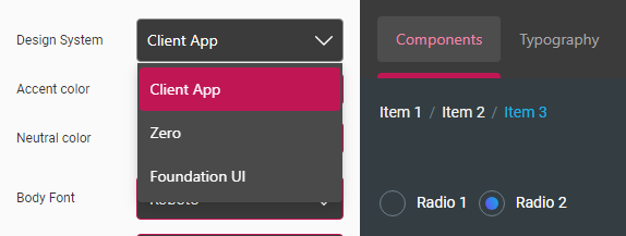
While in preview mode, you will see Zero and Foundation UI in the dropdown list of Design System. But in application mode, you will see one more design system.
For example, if you have launched DSC from an application called client-app, you will also see Client App in the dropdown list.
| Preview dropdown | Application dropdown |
 |  |
In the editor, after you have configured the design system, there are two more things you can do:
Saving tokens
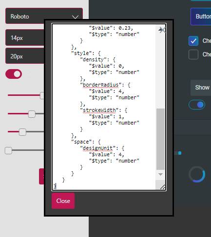
Once you're happy with all the changes, click on the Save button. At this point, a modal is displayed showing the configured design tokens in a JSON format.
Because this is only a preview, only the Close button is shown on the modal. When the DSC app is launched, you will see another Save button parallel to the Close one. Click on the Save button to save all the changes; this is reflected in the application where you're running the Design System Configurator.
See the images below.
| Preview Modal | Application Modal |
 | 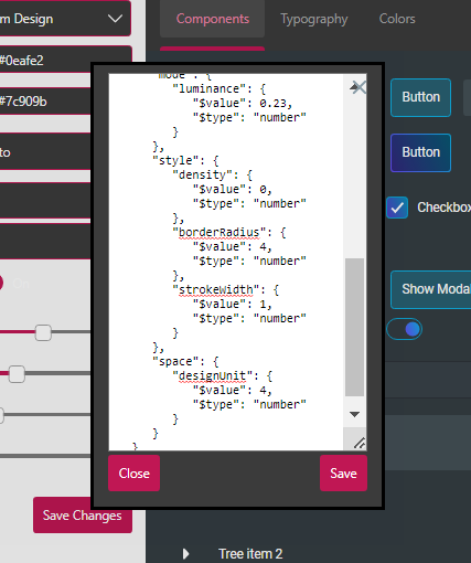 |
Resetting tokens
Alternatively, if you no longer need the modifications you have made, click the Reset button, which resets the values back to their default state.
Preview
The preview shows four tabs displaying the information suggested by their titles.
Components
The contents of the Components tab reflect the components that are affected by the configurations of the design tokens.
The components we see here are only a small collection used for the purpose of displaying an example. Setting the styles using the configuration tool will set the styles of all of the primitive components in the Interaction, Forms, and Presentation sections.
Typography
The Typography tab displays the list of typography tokens you to adjust. Click on the tab in the preview and observe the changes to the Body Font, Base Font Size and Base Line Height as you configure these tokens on the left-hand side.
Colors
The Colors tab, as you may suspect, shows the design tokens available for setting colour. Click on the Colors tab to view your changes as you configure the Accent color and Neutral color design tokens.
Form
The Form tab displays a Smart Form. This is another component available for you to use. It uses a collection of other components, such as text-field, combobox and checkbox. Design tokens such as Density and Design Unit trigger more visible changes in the preview. Go to the Form tab and configure the design tokens in the editor to see the results.
