Web basics - inserting a grid
Previously, we showed you how to create a new page. Now we shall add a data grid.
The new page
To remind you, the new page that we created has the following files:
- /test-page/test-page.template.ts
- /test-page/test-page.ts
- /test-page/test-page.styles.ts
Add a grid with all columns
In the template file, start by adding the Genesis data source pointing to the appropriate resource name; this must be wrapped in a grid of your choice.
<zero-grid-pro>
    <grid-pro-genesis-datasource
        resourceName="ALL_POSITIONS"
        orderBy="INSTRUMENT_ID">
    </grid-pro-genesis-datasource>
</zero-grid-pro>
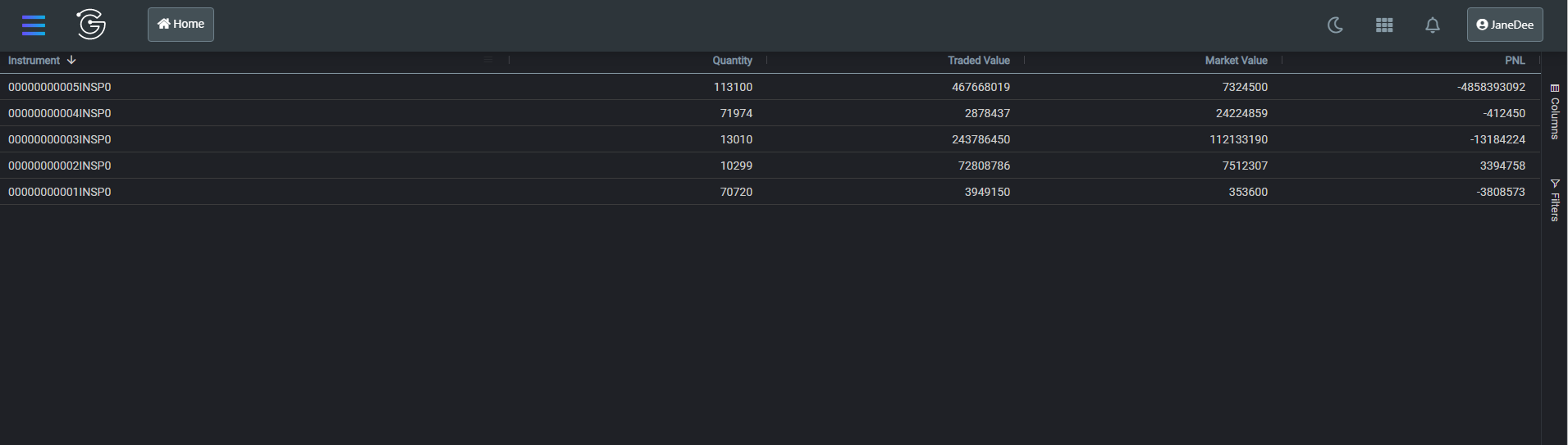
This gives you a grid displaying all the columns available in the ALL_POSITIONS resource:
Grid interaction
To add new columns that are not part of the API, we can add additional column definitions.
<zero-grid-pro>
    <grid-pro-genesis-datasource
        resourceName="ALL_POSITIONS"
        orderBy="INSTRUMENT_ID">
    </grid-pro-genesis-datasource>
    <grid-pro-column :definition="${x => x.singlePositionActionColDef}" />
</zero-grid-pro>
In the component definition file, we can provide a method that enables us to interact with the rest of the class. The example below creates a column with a button that logs data in the row to the console. Here you can easily swap logging the row data with some custom logic (such as calling a back-end API, which we shall cover in more detail later on).
  public singlePositionActionColDef = {
    headerName: 'Action',
    minWidth: 120,
    maxWidth: 120,
    cellRenderer: 'action',
    cellRendererParams: {
      actionClick: async (rowData) => {
        console.log(rowData);
      },
      actionName: 'Add Trade',
      appearance: 'primary-gradient',
    },
    pinned: 'right',
  };
After refreshing the application, the grid should also include a column containing a button:
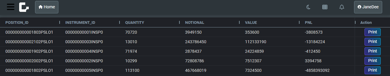
Custom column config
If you want to customise how each column is displayed, you can provide a column config for every column.
Create a new file called positionColumnDefs.ts in the same directory.
export const positionColumnDefs = [
  {field: 'INSTRUMENT_ID', headerName: 'Instrument', sort: 'desc', flex: 2},
  {field: 'QUANTITY', headerName: 'Quantity', type: 'rightAligned', flex: 1, enableCellChangeFlash: true},
  {field: 'NOTIONAL', headerName: 'Traded Value', type: 'rightAligned', flex: 1, enableCellChangeFlash: true},
  {field: 'VALUE', headerName: 'Market Value', type: 'rightAligned', flex: 1, enableCellChangeFlash: true},
  {field: 'PNL', headerName: 'PNL', type: 'rightAligned', flex: 1, enableCellChangeFlash: true},
];
To stop automatic generation of columns, you need to add the only-template-col-defs attribute to the zero-grid-pro.
Then use the repeat directive; this includes all the columns from our column config array.
import {positionColumnDefs} from './positionColumnDefs';
import {repeat} from '@microsoft/fast-element';

<zero-grid-pro only-template-col-defs>
    <grid-pro-genesis-datasource
        resourceName="ALL_POSITIONS"
        orderBy="INSTRUMENT_ID">
    </grid-pro-genesis-datasource>
    ${repeat(() => positionColumnDefs, html`
    <grid-pro-column :definition="${x => x}"></grid-pro-column>
    `)}
    <grid-pro-column :definition="${x => x.singlePositionActionColDef}"></grid-pro-column>
</zero-grid-pro>
Columns will now flash green as the value inside changes:

Saving user preferences
You can add the persist-column-state-key to the zero-grid-pro to persist user changes to things such as sorting, column order, and visibility on the user machine. With this, when the user reloads the browser, they get the same configuration.
<zero-grid-pro
    persist-column-state-key='position-grid-settings'
>