Customizing the header
You can customize:
- the icon shown on the navigation bar and flyout menu (this shows the Genesis logo by default)
- navigation links at the left-hand side of the navigation bar
- the background colour used for the currently selected route (and related submenu row), via design tokens — see Selected route highlight colour
- the control buttons on the right-hand side of the navigation bar; these can be shown or hidden, and their behaviour controlled via event listeners
- optional Feature Flags control for toggling URL
feature.*parameters - the contents of the flyout menu
Examples
Here is an example of the navigation bar with three navigation items, and all three control buttons shown.

This next example is the same as the previous example, except the Genesis logo is replaced with a custom icon.

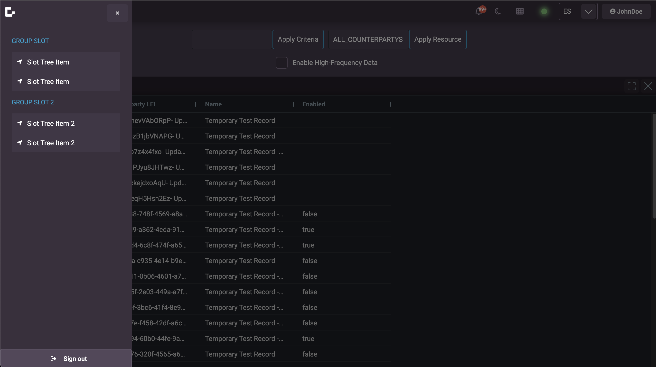
In this next example, we have put a set of example options set in the flyout menu.
Header set-up
A lot of the Genesis seed apps come with the Header set up by default. To verify, you can do a text search in the client code for the <foundation-header> tag.
Icon
By default, the navigation bar and flyout menu show the Genesis logo. You can override this by setting the logo-src attribute. For example:
<foundation-header logo-src="https://icotar.com/avatar/genesis"></foundation-header>
The logo-src defines the image that you want to display. Adding this attribute updates the logo on both the flyout and navigation bar. If you want to keep the Genesis logo, just omit this attribute.
Selected route highlight colour
Changing --foundation-header-selected-item-background is how you control the route highlight: set it to any colour you choose (a hex value, a design token, and so on), or remove the highlight entirely by matching the normal button background (see below) or using transparent where the component uses this variable only as a border or stroke (for example the flyout accent stripe).
When a top-level route or submenu row matches the current pathname, the header applies selected styling. On the main bar and submenu rows, the fill for that state uses --foundation-header-selected-item-background. If you do not set it, it falls back to var(--accent-fill-rest) (accent “rest” fill).
Unselected nav buttons use --foundation-header-rest-item-background, which defaults to var(--neutral-fill-rest).
Set these on foundation-header (or on any ancestor that wraps the header so variables inherit):
Custom highlight colour
foundation-header {
  --foundation-header-selected-item-background: #2b6cb0; /* example */
}
Prefer design-system tokens where possible (for example var(--accent-fill-rest) or another palette token) so the header stays consistent with light/dark and branding.
Match the normal button fill (no accent highlight)
To use the same background as the default route buttons — so the highlight is effectively turned off while route selection logic still runs — point the selected token at the same source as the rest state:
foundation-header {
  --foundation-header-selected-item-background: var(
    --foundation-header-rest-item-background,
    var(--neutral-fill-rest)
  );
}
If you customise --foundation-header-rest-item-background elsewhere, the selected state will follow that value automatically.
| Area | What happens | If you need to adjust it |
|---|---|---|
| Text colour | Selected route rows use var(--foreground-on-accent-rest) for text, which assumes an accent-like background. | If you switch the selected background to a neutral fill and contrast looks wrong, add a targeted override in your app styles (for example on .route-selected / .sub-selected) so text uses an appropriate neutral foreground token. |
| Dropdown indicator | When a parent item has an active child route, the chevron colour uses --highlight-selected-dropdown, falling back to var(--accent-fill-rest). | Override --highlight-selected-dropdown so the arrow matches a neutral treatment or your palette. |
| Flyout / side menu | In the slide-out route list, the selected row keeps a neutral background and uses a left border coloured with --foundation-header-selected-item-background. | Set that token to transparent or a neutral stroke token to remove the accent stripe on the flyout while the same variable still controls the main bar fill. |
Navigation items
You can add navigation items to the left-hand side of the navigation bar. For each element, you can set slot="routes" attribute, so that navigation is controlled via a click handler. The following is a really basic example for adding 'Home' and 'Profiles' buttons:
- React
- Genesis
- Angular
import { useRef } from 'react';
import { Button } from '@genesislcap/rapid-design-system/react';
import { FoundationHeader } from '@genesislcap/foundation-header/react';

const HeaderBasicRoutesExample = () => {
  const headerRef = useRef(null);

  const navigateTo = (path: string) => {
    headerRef.current?.navigation?.navigateTo(path);
  };

  return (
    <FoundationHeader ref={headerRef}>
      <Button slot="routes" value={1} onClick={() => navigateTo('home')}>
        Home
      </Button>
      <Button slot="routes" value={2} onClick={() => navigateTo('profiles')}>
        Profiles
      </Button>
    </FoundationHeader>
  );
};
@customElement({
  name: 'header-basic-routes-example',
  template: html`
    <foundation-header>
      <rapid-button
        slot="routes"
        value="1"
        @click=${(x, c) => c.parent.navigation.navigateTo('home')}
      >Home</rapid-button>
      <rapid-button
        slot="routes"
        value="2"
        @click=${(x, c) => c.parent.navigation.navigateTo('profiles')}
      >Profiles</rapid-button>
    </foundation-header>
  `,
})
export class HeaderBasicRoutesExample extends GenesisElement {}
import { Component, CUSTOM_ELEMENTS_SCHEMA, ElementRef, ViewChild } from '@angular/core';

@Component({
  selector: 'header-basic-routes-example',
  template: `
    <foundation-header #foundationHeader>
      <rapid-button slot="routes" value="1" (click)="navigateTo('home')">
        Home
      </rapid-button>
      <rapid-button slot="routes" value="2" (click)="navigateTo('profiles')">
        Profiles
      </rapid-button>
    </foundation-header>
  `,
  schemas: [CUSTOM_ELEMENTS_SCHEMA],
})
export class HeaderBasicRoutesExampleComponent {
  @ViewChild('foundationHeader') foundationHeader!: ElementRef;

  navigateTo(path: string) {
    this.foundationHeader.nativeElement.navigation?.navigateTo(path);
  }
}
The navigation object referenced via the parent object (Genesis) or the header ref (React) is why the navigation object is added as an attribute to the router in the setup step. From it, the navigateTo method can be called, which allows the user to navigate around the finished application from the navigation buttons.
Moving on from this basic example, a dynamic set of routes can be configured, using the repeat directive from @genesislcap/web-core.
Here is an example of a simple navigation bar with two navigation items. This header does not show additional control buttons but displays the default ones, allowing for showing submenus, the logged-in user's name, and the connection status.
- React
- Genesis
- Angular
Declaration:
<foundation-header></foundation-header>
Usage:
@customElement({
  name: 'header-dynamic-routes-example',
  template: html`
    <foundation-header>
      ${repeat(
        (x) => x.allRoutes,
        html`
          <rapid-button
            slot="routes"
            appearance="neutral-grey"
            value="${(x) => x.index}"
            @click=${(x, c) => c.parent.navigation.navigateTo(x.path)}
          >
            <rapid-icon variant="${(x) => x.variant}" name="${(x) => x.icon}"></rapid-icon>
            ${(x) => x.title}
          </rapid-button>
        `
      )}
    </foundation-header>
  `,
})
export class HeaderExample extends GenesisElement {
  const allRoutes = [
    { index: 1, path: 'protected', title: 'Home', icon: 'home', variant: 'solid' },
    { index: 2, path: 'admin', title: 'Admin', icon: 'cog', variant: 'solid' },
    { index: 3, path: 'reporting', title: 'Reporting', variant: 'solid' },
  ];
}
Declaration:
<FoundationHeader></FoundationHeader>
Usage:
import React, { useRef, useEffect } from 'react';
import { Button, Icon } from '@genesislcap/rapid-design-system/react';
import { FoundationHeader } from '@genesislcap/foundation-header/react';

const allRoutes = [
  { index: 0, path: '/home', variant: 'home', icon: 'home', title: 'Home' },
  { index: 1, path: '/profiles', variant: 'profile', icon: 'user', title: 'Profiles' },
  // Add more routes as needed
];

const FoundationHeaderExample = () => {
  const foundationHeaderRef = useRef(null);

  const navigateTo = (path) => {
    const foundationHeaderElement = foundationHeaderRef.current;
    if (foundationHeaderElement && foundationHeaderElement.navigation) {
      foundationHeaderElement.navigation.navigateTo(path);
    }
  };

  return (
    <FoundationHeader ref={foundationHeaderRef}>
      {allRoutes.map((route) => (
        <Button
          slot="routes"
          key={route.index}
          appearance="neutral-grey"
          value={route.index}
          onClick={() => navigateTo(route.path)}
        >
          <Icon variant={route.variant} name={route.icon}></Icon>
          {route.title}
        </Button>
      ))}
    </FoundationHeader>
  );
};

export default FoundationHeaderExample;
Declaration:
<foundation-header></foundation-header>
Usage
import { Component, CUSTOM_ELEMENTS_SCHEMA, ViewChild, ElementRef, AfterViewInit } from '@angular/core';

@Component({
  selector: 'header-dynamic-routes-example',
  template: `
    <foundation-header #foundationHeader>
      <ng-container *ngFor="let route of allRoutes">
        <rapid-button
          slot="routes"
          appearance="neutral-grey"
          [value]="route.index"
          (click)="navigateTo(route.path)"
        >
         <rapid-icon [variant]="route.variant" [name]="route.icon"></rapid-icon>
          {{ route.title }}
        </rapid-button>
      </ng-container>
    </foundation-header>
  `,
  schemas: [CUSTOM_ELEMENTS_SCHEMA]
})
export class HeaderDynamicRoutesExampleComponent implements AfterViewInit {
  @ViewChild('foundationHeader') foundationHeader: ElementRef;

  allRoutes = [
    { index: 0, path: '/home', variant: 'home', icon: 'home', title: 'Home' },
    { index: 1, path: '/profiles', variant: 'profile', icon: 'user', title: 'Profiles' },
    // Add more routes as needed
  ];

  ngAfterViewInit() {
    // Access the foundation-header component after the view has been initialized
  }

  navigateTo(path: string) {
    const foundationHeaderElement = this.foundationHeader.nativeElement;
    foundationHeaderElement.navigation.navigateTo(path);
  }
}
Submenus
You can create hierarchical navigation by adding submenus to your main navigation items. This is done by including a navItems array in your route configuration. Each submenu item can either navigate to a specific route or trigger a custom action.
Here's an example of how to configure routes with submenus:
const routes = [
  {
    path: 'fx',
    element: async () => (await import('./fx/fx')).Fx,
    title: 'FX',
    name: 'fx',
    navId: "header",
    settings: { autoAuth: true },
    navItems: [
      { title: 'FX Cash', routePath: 'grids/fx-cash' },
      { title: 'FX Options', routePath: 'grids/fx-options' },
      {
        title: 'Request Price',
        onClick: () => {
          console.log('Requesting for price');
        },
      },
    ],
  },
  {
    path: 'grids/fx-cash',
    title: 'FX Cash',
    element: async () => (await import('./grids/fx-cash/fx-cash')).FxCash,
  },
  {
    path: 'grids/fx-options',
    title: 'FX Options',
    element: async () => (await import('./grids/fx-options/fx-options')).FxOptions,
  },
];
In this example:
- The main "FX" navigation item has three submenu items
- "FX Cash" and "FX Options" navigate to specific routes using
routePath - "Request Price" triggers a custom action using
onClick
Nested submenu permissions
You can define permission on nested submenu items (inside navItems) the same way you do for top-level items. Permission checks are applied to both levels.
const routes = [
  {
    title: 'FX',
    routePath: 'fx',
    navItems: [
      { title: 'FX Cash', routePath: 'grids/fx-cash', permission: 'CAN_VIEW_CASH' },
      { title: 'FX Options', routePath: 'grids/fx-options', permission: 'CAN_VIEW_OPTIONS' },
    ],
  },
];
If the current user does not have permission for a nested item, that submenu entry is not shown.
Layout item indicators
For nav items that represent layout tabs (instead of route navigation), you can:
- Set
isLayoutItem: true - Provide a unique
layoutRegistrationvalue - Bind
layoutItemCheckonfoundation-headerto determine whether each layout item is active
When active, the item is visually highlighted in the header/dropdown.
const routeNavItems = [
  {
    title: 'Dashboard',
    routePath: 'dashboard',
  },
  {
    title: 'Orders Tab',
    isLayoutItem: true,
    layoutRegistration: 'orders',
    onClick: () => addLayoutItem('orders'),
  },
];

@customElement({
  name: 'header-layout-items-example',
  template: html`
    <foundation-header
      :routeNavItems=${() => routeNavItems}
      :layoutItemCheck=${(x) => (registration) => x.currentLayoutItems.includes(registration)}
    ></foundation-header>
  `,
})
export class HeaderLayoutItemsExample extends GenesisElement {
  currentLayoutItems = ['orders'];
}
See layout management guidance.
Configuration attributes
The following attributes control the appearance and behavior of the header:
| Attribute | Type | Description | Example |
|---|---|---|---|
hide-side-bar | boolean | Hides the sidebar in the navigation menu. Default is false. | |
logout-button-position | string | Controls the position of the logout button. Can be 'side-nav', 'account-menu', or 'none'. Default is 'side-nav'. | |
show-account-menu | boolean | Shows the account menu in the navigation. Default is false. | |
Control buttons
There are three control buttons that can be shown or hidden on the right-hand side of the navigation bar (these are hidden by default). Each one of them is a boolean attribute that can be added where the <foundation-header> tag is defined.
| Attribute | Type | Description | Example |
|---|---|---|---|
show-luminance-toggle-button | boolean | Shows the luminance toggle button (moon icon) in the navigation bar. Dispatches luminance-icon-clicked event when clicked. | |
show-misc-toggle-button | boolean | Shows the miscellaneous toggle button in the navigation bar. Dispatches misc-icon-clicked event when clicked. | |
show-notification-button | boolean | Shows the notification button in the navigation bar. Dispatches notification-icon-clicked event when clicked. | |
Implementing the functionality of the buttons is up to the client. For example:
- Define the functionality of the event callback in the class of a class which is a parent to the router.
export class MainApplication extends GenesisElement {

  onMiscButtonPressed() {
    // ... do something
  }
  //...
}
- Set the event listener in the parent html to call the defined functionality.
const MainTemplate: ViewTemplate<MainApplication> = html`
  <foundation-router
    :navigation=${(x) => x.navigation}
    @misc-icon-clicked=${(x) => x.onMiscButtonPressed()}
  >
  </foundation-router>
`;
Menu contents
To set the content of the flyout menu, add the content in the html within an element that has the slot="menu-contents" attribute.
<foundation-header>
  <div slot="menu-contents">
    <!-- Example markup -->
    <p>GROUP SLOT</p>
    <rapid-tree-view>
      <rapid-tree-item>
        <rapid-icon name="location-arrow"></rapid-icon>
        Slot Tree Item
      </rapid-tree-item>
      <rapid-tree-item>
        <rapid-icon name="location-arrow"></rapid-icon>
        Slot Tree Item
      </rapid-tree-item>
    </rapid-tree-view>
    <p>GROUP SLOT 2</p>
    <rapid-tree-view>
      <rapid-tree-item>
        <rapid-icon name="location-arrow"></rapid-icon>
        Slot Tree Item 2
      </rapid-tree-item>
      <rapid-tree-item>
        <rapid-icon name="location-arrow"></rapid-icon>
        Slot Tree Item 2
      </rapid-tree-item>
    </rapid-tree-view>
  </div>
</foundation-header>
You can also customize the account menu content by using the slot="account-menu" attribute when show-account-menu is enabled:
<foundation-header show-account-menu>
  <div slot="account-menu">
    <!-- Custom account menu content -->
    <p>Welcome, User!</p>
    <rapid-button>Profile Settings</rapid-button>
  </div>
</foundation-header>
Slots
| Name | Description |
|---|---|
| routes | Slot for navigation route buttons in the header |
| routes-end | Slot for additional navigation buttons at the end of the header |
| menu-contents | Slot for content in the side navigation menu |
| account-menu | Slot for custom account menu content when account menu is enabled |