Web Developer training - Day one
This day covers:
Reviewing basic concepts
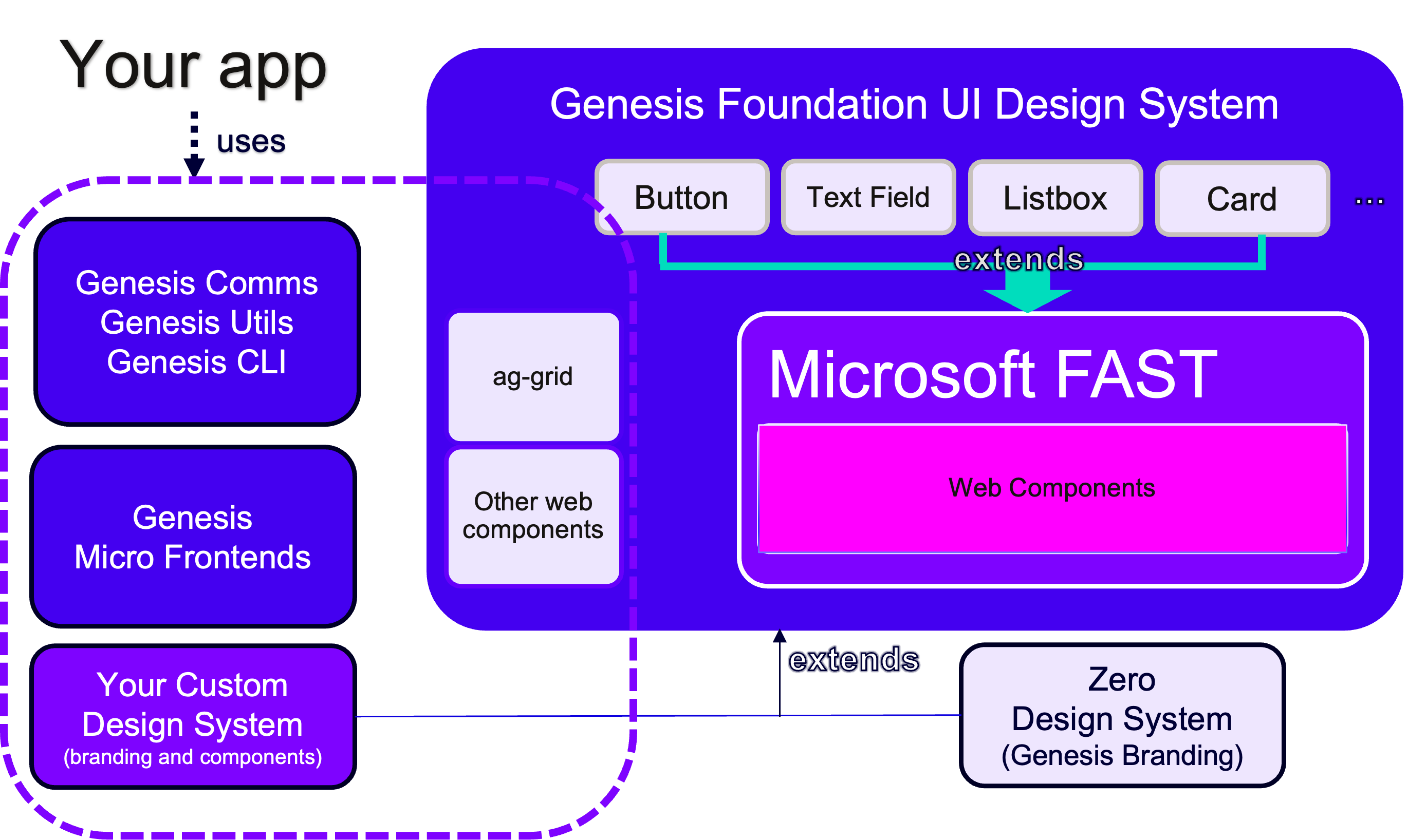
As introduced in the Developer Training, Genesis provides a modern future-proofed web stack on top of Microsoft FAST, which is a lightweight abstraction that enables you to easily build performant, memory-efficient, standards-compliant Web Components. You can find more about Microsoft FAST and fast-foundation at its main documentation website, which includes an API reference.
Genesis also offers a highly configurable design system called Genesis Foundation UI. It is made up of a set of Web Components and accompanying design tokens. This enables you to control visual design in myriad ways using the tokens, CSS, element templates and shadow DOM options.
This picture gives an overview of how it all ties together:
Feel free to revisit the UI chapter of the Developer Training before we get into other aspects of the underlying technology used by Genesis in the next sections.
Why Web Components?
Remember that Web Components are custom html elements that completely encapsulate their logic to create self-contained reusable components. These components do not clash or interfere with the rest of application. Genesis offers a comprehensive set of Web Components, from simple components like a Button and Text Field, to more complex ones like Micro Front-end apps.
Performance
Web Components have proven to be consistently faster than many popular JavaScript frameworks when it comes to both startup time and paint performance. They also use less memory and often result in significantly smaller bundle sizes when compared to their JavaScript counterparts. Standard benchmarks show our component implementation outperforming React, Angular 12, Vue 3.2 as well as many others.
Interoperability
Every Web Component inherits from HTMLElement. So, Web Components seamlessly interoperate with any library or framework designed to work with DOM. This includes modern frameworks like React, Angular, Vue, etc. but also libraries like jQuery and others. Adopting Web Components enables use of a consistent component library across a diverse set of applications. So, teams can standardise on the components and design system without having to force a specific architecture or framework on the application developer.
Incremental adoption
You do not have to re-write an existing app or site to take advantage of Web Components. Since Web Components just extend the palette of available HTML elements, you can choose to simply start leveraging whatever custom elements you want within your existing app the same way as you use built-in elements.
Future-proof
Web Components are literally, the standard component model of the web, written into the HTML specification. The base features have shipped in every modern browser and many new features are planned for the DOM and CSS standards. Some of these new HTML capabilities will only be available to Web Components, so continuing down the path of non-standard component models will prevent you from taking advantage of platform improvements. Aligning yourself with Web Components and other standards will enable you to get the greatest benefit from the evolving web platform.
Extensible ecosystems and plugin models
By choosing Web Components, you enable your customers to choose their preferred application framework or library, rather than forcing them to use any particular JavaScript framework. Building your ecosystem or plugin model around one framework often means the exclusion of an entire set of customers who build on another.
You no longer need JavaScript framework experts
Most of the popular JavaScript frameworks require strong JavaScript skills and knowledge and often at least an intermediate proficiency for use. Web Components can be used without any knowledge of JavaScript whatsoever. Building around Web Components opens up opportunities for a broader range of customers with more diverse backgrounds.
Who is using Web Components?
Across the industry we see a pretty big adoption since January 2020. This includes not only heavy investment from Microsoft, but also from Google, Adobe, Salesforce, SAP, MIT, SpaceX, and many more. Curious who else is using Web Components? Check out the ever-growing list of companies.
And why Microsoft FAST?
Genesis basic Web Components, such as Button and Text Fields, were not created from scratch. They extend Microsoft FAST components for a number of reasons:
- FAST is a collection of technologies built on Web Components and modern Web Standards.
- Proven at scale in production. FAST powers Edge, Bing, Maps, Ads, News and other web products at Microsoft. As such, it will power all their next gen web components and design-system technologies.
- Provides a comprehensive and growing component set out of the box, built directly on the W3C Web Component standards with accessibility built in.
- Extensible and highly efficient base element to build Genesis domain specific components.
- Uses Constructable Stylesheet Objects to efficiently re-use CSS across components.
- Advanced design-system architecture to support custom theming between clients and applications.
- Offers a DI system, a Router and other opt-in utilities.
- Highly active and responsive community.
A deeper dive into the alpha web application structure
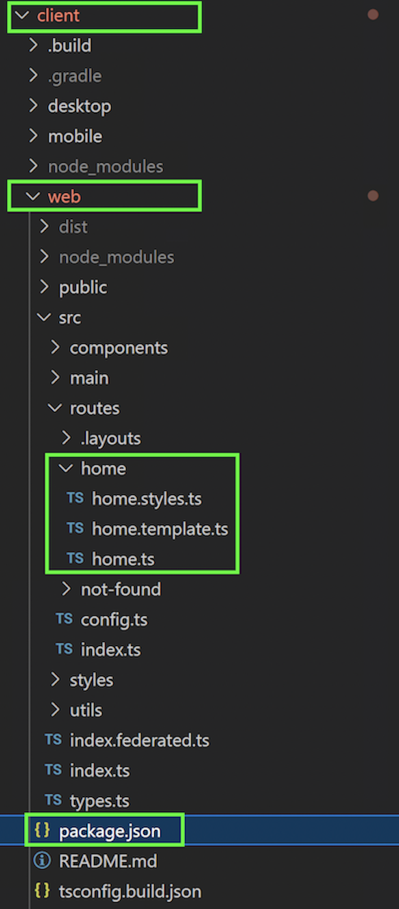
The alpha application, the one we developed during the Developer training, had a basic UI with a simple page a few components. Open the project on your favourite IDE and you should see an initial project structure like this:
Remember that the initial project structure can be generated by GenX if you are starting from scratch.
The monorepo
This is a lerna managed monorepo. One possible definition of a monorepo is a single repository containing multiple distinct projects, with well-defined relationships. In our case, it basically means your back-end and front-end code reside in the same repo in different folders. The web code is in the client/web folder.
Genesis components are standards-based Web Components, making them compatible with almost any modern web framework such as Angular, React or Vue.
Thus, it's important to note that under the client/web folder you can run pretty much any modern web framework you want, as long you set it up.
package.json file
In client/web, you'll also find a package.json file. This file is used to give information to npm to enable it to identify the project as well as handle the project's dependencies. It can also contain other metadata, such as a project description, the version of the project in a particular distribution, licence information or even configuration data.
Looking deeper at our package.json, at the top you'll find the name and description of your application.
Following this, there are three key sections you need to be aware of:
- config
- scripts
- dependencies
Config
When running the app on your local machine, you can adjust a few settings under the config section, including which host to connect to and what port to run the dev server on.
  "config": {
    "API_HOST": "ws://localhost:9064",
    "DEFAULT_USER": "JaneDee",
    "DEFAULT_PASSWORD": "beONneON*74",
    "PORT": 6060
  },
Since our back end is running locally, we set the API_HOST to localhost (ws://localhost:9064).
Scripts
The next section is scripts.
  "scripts": {
    "build": "npm run build:webpack",
    "build:with-host": "cross-env API_HOST=$npm_package_config_API_HOST npm run build:webpack",
    "build:webpack": "cross-env NODE_ENV=production AUTO_CONNECT=true webpack",
    "clean": "npm run clean:dist",
    "clean:dist": "node ../.build/clean.js dist",
    "copy-files": "copyfiles -u 1 src/**/*.{css,scss,ttf} ./dist/esm",
    "dev": "npm run dev:webpack",
    "dev:webpack": "cross-env API_HOST=$npm_package_config_API_HOST AUTO_CONNECT=true DEFAULT_USER=$npm_package_config_DEFAULT_USER DEFAULT_PASSWORD=$npm_package_config_DEFAULT_PASSWORD NODE_ENV=development webpack serve --open",
    "serve": "serve dist -p $npm_package_config_PORT",
    "test": "echo \"Error: no test specified\""
  },
Your settings from the config block will be passed to different scripts as environment variables, using cross-env.
Also, note that we rely on webpack to bundle the application. You'll find the webpack.config.js configuration file in client/web .
Dependencies
Last but not least, the dependencies section contains a list of your app's dependencies and their versions.
This includes @genesislcap dependencies. This is where you can change versions to upgrade to a newer version of the platform.
  "dependencies": {
    "@genesislcap/foundation-comms": "14.15.2",
    "@genesislcap/foundation-entity-management": "14.15.2",
    "@genesislcap/foundation-forms": "14.15.2",
    "@genesislcap/foundation-header": "14.15.2",
    "@genesislcap/foundation-layout": "14.15.2",
    "@genesislcap/foundation-login": "14.15.2",
    "@genesislcap/foundation-ui": "14.15.2",
    "@genesislcap/foundation-utils": "14.15.2",
    "@genesislcap/foundation-zero": "14.15.2",
    "@genesislcap/foundation-zero-grid-pro": "14.15.2",
    "@genesislcap/foundation-reporting": "14.15.2",
    "@genesislcap/g2plot-chart": "14.15.2",
    "@microsoft/fast-components": "^2.21.6",
    "@microsoft/fast-element": "^1.7.0",
    "@microsoft/fast-foundation": "^2.33.4",
    "@microsoft/fast-router": "^0.4.2",
    "@microsoft/fast-web-utilities": "^5.1.0",
    "rxjs": "^7.5.4",
    "tslib": "^2.3.1"
  }
You can use the lerna add command (instead of npm install) if you need to add more dependencies, since the app is a lerna managed monorepo.
Deploying
For Genesis application servers, the web server of choice is nginx.
As explained previously, we have provided a docker container with nginx pre-installed and running for this training. nginx is used here as a reverse proxy. We're not going to deploy our application to that nginx instance, though; we're going to simply use the local web server initiated by npm run client:web or npm run dev command.
For actual server deployment, these are the steps that you'd need to follow:
- Build the project:
npm run buildfrom the ..client/web folder - Copy the content of the ..client/web/dist/ folder to the root folder of your web server. To find the root folder, look in the
rootdirective in the server block of nginx.conf file.
You can zip and unzip the content of dist to make it quicker.
More information on Web Deployment.
Web pages
To view or use your Genesis application, you need to create one or more web pages. On each of these pages, you need to have components that display information or enable the user to interact with the application.
In the Developer Training, we amended these files in the client/web/src/routes/home folder:
- home.template.ts
- home.ts
- home.styles.ts
We usually follow the pattern of creating .template.ts, .ts and .styles.ts files. But it doesn't have to be that way; it could be a single file, for example, as we're going to see next.
Realistically, any application will require multiple pages and routes.
If you're not familiar with the concept of routing, it's basically displaying different content or pages according to different URL addresses. In this context, it means that different routes correspond to different contents or pages on the front end; this is implemented by the server returning different pages according to the different URLs. In single-page applications, most pages are structurally unchanged and only part of the content is changed.
In our case, there's a home route pointing to the Home component which is the home page. The routes are set in the config.ts and we'll get into more details soon.
Building components
As you know, in the Developer Training we created the Home component but didn't get into too much detail on how component building actually works. So, let's take a step back and create a new page with a single file for the purpose of learning how to set up new components so we understand the foundations before starting our new application.
There are two main approaches to building a component:
- The first approach is for simple declarations of non-shared components.
- The second approach is for components designed to be published in shareable libraries.
The second approach involves design systems and we will cover this topic later in this training. For now, let's see how the first approach would work, creating a very simple component.
Defining a custom component
Create folder ./client/web/src/routes/playground/ and create a new empty file called playground.ts in there. Then, add this code to playground.ts:
import { FASTElement, customElement } from "@microsoft/fast-element";

@customElement({ name: "marketdata-component" }) // custom element being created
export class MarketdataComponent extends FASTElement {}
We've just created a new Web Component extending FASTElement (so, again, we don't have to start from scratch and implement a myriad of attributes and methods).
This component could be anything, like a custom button or even a business component. But, for now, it's just empty and doesn't do much. However, we could already use it anywhere in HTML with the following markup if we wanted:
<marketdata-component></marketdata-component>
Adding a route to the new component
Let's add a route pointing to playground so we can access it from the menu.
-
Edit file
client\web\src\routes\config.tsand add playground to allRoutes and routes.map so we'll be able to access playground from the menu:config.tsimport { MarketdataComponent } from './playground/playground';
...
public allRoutes = [
...
{ index: 2, path: 'playground', title: 'Playground', icon: 'home', variant: 'solid' },
];
...
public configure() {
...
this.routes.map(
...
{ path: 'home', element: Home, title: 'Home', name: 'home' },
{ path: 'not-found', element: NotFound, title: 'Not Found', name: 'not-found' },
{path: 'playground', element: MarketdataComponent, title: 'Playground', name: 'playground', settings: commonSettings},
);
```
You should see the Playground menu item now.
Creating an HTML template
To create an HTML template for our element, we have to import and use the html-tagged template helper and pass the template to the @customElement decorator.
import { FASTElement, customElement, html } from "@microsoft/fast-element";

const myTemplate = html<MarketdataComponent>`
  <div class="header">
    <h3>My marketdata component</h3>
  </div>
`;

@customElement({ name: "marketdata-component", template: myTemplate }) // custom element being created
export class MarketdataComponent extends FASTElement {}
As you see, we're defining a const called myTemplate, which contains the HTML code. This constant is then passed to the definition of our customElement through the template parameter. This way, when we use this component, it will display the HTML associated with it.
Try it now!
Adding attributes to the component
Let's add an attribute to our MarketdataComponent. Use @attr for primitive properties (string, bool, number) that are intended to be surfaced on your element as HTML attributes. Use @observable for all other property types on an HTMLElement and all observable properties on plain classes.
import {
  FASTElement,
  customElement,
  html,
  attr,
} from "@microsoft/fast-element";

@customElement({ name: "marketdata-component", template: myTemplate })
export class MarketdataComponent extends FASTElement {
  @attr lastPrice: number = 0;
}
Having the lastPrice always as zero doesn't make our MarketdataComponent very useful. Let's change the HTML template to display the price in real time and add some behaviour to the component, so that it gets the price in real time (in this example, we're simulating the exchange behaviour with a Math.random function):
import {
  FASTElement,
  customElement,
  html,
  attr,
} from "@microsoft/fast-element";

const myTemplate = html<MarketdataComponent>`
  <div class="header">
    <h3>My Marketdata component</h3>
    <h4>Last price: ${(x) => x.getLastPriceRealTime()}</h4>
  </div>
`;

@customElement({ name: "marketdata-component", template: myTemplate }) // custom element being created
export class MarketdataComponent extends FASTElement {
  @attr lastPrice: number = 0;

  public getLastPriceRealTime() {
    let priceFromExchange = Math.random() * 10;
    setInterval(() => {
      this.lastPrice = priceFromExchange;
    }, 1000);
    return this.lastPrice;
  }
}
Try it now and you'll see the price being updated dynamically!
Don't forget to notice this line:
<h4>Last price: ${(x) => x.getLastPriceRealTime()}</h4>
The x refers to the custom-element class instance. This is called binding and you can check all binding types here.
FAST also provides directives, such as when and repeat that are very useful for conditionals and looping through a data structure in your templates.
Examples:
import { FASTElement, customElement, observable, html, when } from "@microsoft/fast-element";

const template = html<MyApp>`
 ...
  ${when(x => !x.ready, html<MyApp>`
    Loading...
  `)}
`;

@customElement({
  name: "my-app",
  template
})
export class MyApp extends FASTElement {
  @observable ready: boolean = false;
  ...
}
import { FASTElement, customElement, observable, html, repeat } from "@microsoft/fast-element";

const template = html<FriendList>`
  ...
    ${repeat(x => x.friends, html<string>`
      <li>${x => x}</li>
    `)}
`;

@customElement({
  name: "friend-list",
  template
})
export class FriendList extends FASTElement {
  @observable friends: Person[] = [];
  ...
}
Please review the directives carefully, as we're going to use them in this training!
Styling our component
FASTElement provides a css tagged template helper that allows for the creation of ElementStyles.
Add this code:
import {
  FASTElement,
  customElement,
  html,
  attr,
  css,
} from "@microsoft/fast-element";
...
const marketdataComponentCSS = css`
  h4 {
    color: #00ffff;
  }
`;
...
Add the styles property to the customElement definition so the component will use the style given:
@customElement({name: "marketdata-component", template: myTemplate, styles: marketdataComponentCSS}) // custom element being created
...
This is the final code:
import {
  FASTElement,
  customElement,
  html,
  attr,
  css,
} from "@microsoft/fast-element";

const marketdataComponentCSS = css`
  h4 {
    color: #00ffff;
  }
`;

const myTemplate = html<MarketdataComponent>`
  <div class="header">
    <h3>My marketdata component</h3>
    <h4>Last price: ${(x) => x.getLastPriceRealTime()}</h4>
  </div>
`;

@customElement({
  name: "marketdata-component",
  template: myTemplate,
  styles: marketdataComponentCSS,
}) // custom element being created
export class MarketdataComponent extends FASTElement {
  @attr lastPrice: number = 0;

  public getLastPriceRealTime() {
    let priceFromExchange = Math.random() * 10;
    setInterval(() => {
      this.lastPrice = priceFromExchange;
    }, 1000);
    return this.lastPrice;
  }
}
There are quite a few more interesting resources, such as composing styles, partial CSS and CSS Directives provided by FAST. Make sure you check these out!
By now, you should have a good understanding of how to build Web Components based on FAST. But, again, make sure to check FAST official documentation.
Exercise 1.1: getting familiar with customElement
30min
Let's change the MarketdataComponent so that it can work with multiple instruments and a fixed price for each of one them (instead of random). This is roughly what it'd look like:
My Marketdata component
Instrument MSFT 101.23
Instrument AAPL 227.12
Steps:
- import observable and repeat from from
@microsoft/fast-element - add a list called instruments to the MarketdataComponent. Feel free to initialize it with a few instruments, such as
@observable instruments: String[] = ["MSFT", "AAPL"]; - change the
lastPriceattribute to a list of prices. Feel free to initialize it with corresponding prices, such as@observable lastPrices: number[] = [101.23, 227.12]; - change
getLastPriceRealTimeto receive the instrument name and return the corresponding price; - in the HTML template, make sure to loop through all the instruments and display the price for each one;
- style it so that the instrument name is displayed in some tone of blue and the price in some tone of green.
You may find it useful: https://www.fast.design/docs/fast-element/using-directives/#the-repeat-directive, make sure to check the special context object as well. Example:
${(x,c) => c.parent.PROPERTY_OF_THE_CONTEXT
Extending our application
What are we going to build
Hopefully, this introduction was enough to recap the basic concepts and introduce some of the web technologies we rely on.
To get started on the implementation of our web app, these are the features we're going to build during the training:
- a proper navigation menu
- a complex order entry screen using multiple components offered by the Genesis UI
- reporting capabilities
- user and profile management
- orders and positions advanced data grids with filters and searching
Some of the non-functional requirements we're going to address along with the implementation of the app:
- override a design system to promote brand alignment and a reusable component library
- components styling
- async communication with the server with Genesis Foundation Comms
Now, let's get down to business!
Adding the navigation menu
Let's use the Header micro front-end to add a simple and nice navigation menu to our application. The Header micro front-end is a semi-batteries included component that consists of a navigation bar and flyout menu, with routing and account logout capabilities.
You can customise:
- the icon shown on the navigation bar and flyout menu (this shows the Genesis logo by default).
- navigation links at the left-hand side of the navigation bar.
- the control buttons on the right-hand side of the navigation bar can be shown or hidden, and their behaviour controlled via event listeners
- the contents of the flyout menu.
Here is an example of the navigation bar with three navigation items, and all three control buttons shown.

This next example is the same as the previous example, except the Genesis logo is replaced with a custom icon.

In this next example, we have put a set of example options set in the flyout menu.
Header set-up
We have already enabled this micro front-end when we created the initial structure of the application in the Developer Training. But for learning purposes, let's review what needs to be done to set up the foundation-header from scratch - compare this with the existing code to get a better understanding.
To enable this micro front-end in our application, we'd have to follow the steps below.
- Make sure you have
@genesislcap/foundation-headeras a dependency in your client/web/package.json file.
{
  ...
  "dependencies": {
    ...
    "@genesislcap/foundation-header": "14.15.2",
    ...
  },
  ...
}
Whenever you change the dependencies of your project, ensure you run the bootstrap command again - from the client folder:
npm run bootstrap
- In our web/src/main/main.ts file, which is our top-level class of our application, make sure you imported and dependency injected the Navigation class.
import { Navigation } from '@genesislcap/foundation-header';

@customElement({ name, template, styles })
export class MainApplication extends FASTElement {
  @inject(MainRouterConfig) config!: MainRouterConfig;
  @inject(Navigation) navigation!: Navigation;

	...

}
- Make sure you have got a reference to the
navigationobject on the FAST router when you instantiate it. This will allow us to set up navigation functionality from the navigation bar in the navigation items step.
...
export const MainTemplate: ViewTemplate<MainApplication> = html`
  <fast-router
    :config=${(x) => x.config}
    :navigation=${(x) => x.navigation}
  ></fast-router>
`;
- Make sure the
foundation-headertag is part of the html that you set as the markup for thedefaultLayoutin your router configuration.
export const defaultLayout = new FASTElementLayout(html`
<div class="container">
  <foundation-header
  ...
</div>`);

export class MainRouterConfig extends RouterConfiguration<LoginSettings> {

	...

	public configure() {
		this.title = 'Example app';
		this.defaultLayout = defaultLayout;
		...
	}
}
Customising the header
Icon
By default, the navigation bar and flyout menu show the Genesis logo. You can override this by setting the logo-src attribute. For example:
<foundation-header
  logo-src="https://icotar.com/avatar/genesis"
></foundation-header>
The logo-src defines the image that you want to display. Adding this attribute will update the logo on both the flyout and navigation bar. If you omit the attribute, this will leave out the Genesis logo.
Exercise 1.2: customising the logo
5 min
Change the logo of the header so it uses this image: https://icotar.com/avatar/webtraining
Navigation items
You can add navigation items to the left-hand side of the navigation bar. For each element, you can set slot="routes" attribute, so that navigation is controlled via a @click event. Here is a really basic example for adding a 'Home' button:
html`
<foundation-header
	<zero-button
		slot="routes"
		value="1"
		@click=${(x) => x.navigation.navigateTo("home")}
	>Home</zero-button>
></foundation-header>`;
From here, the navigateTo method can be called, which allows the user to navigate around the finished application from the navigation buttons.
Moving on from this basic example, a dynamic set of routes can be configured, using the repeat directive from FAST.
- Look at the routes configuration in the config.ts and you'll see an array in the router configuration class.
export class MainRouterConfig extends RouterConfiguration<LoginSettings> {

	// New configuration added to existing MainRouterConfig class
  public allRoutes = [
    { index: 1, path: 'home', title: 'Home', icon: 'home', variant: 'solid' },
    { index: 2, path: 'playground', title: 'Playground', icon: 'home', variant: 'solid' },
  ];

	...
}
If you look at the icon and variant properties, you'll see that you can change the icon displayed on the top menu bar.
Take a look at the fontawesome icons. You can customize it by changing its properties' values. Try to use icon: 'gear' and check.
- Now, when setting the navigation items, we can use the
repeatdirective to iterate over the defined routes and create a navigation item for each.
Look at the default.ts and you'll see how we create a button with an associated logo for each of the three defined routes:
html` <foundation-header
  ${repeat(
    (x) => x.config.allRoutes,
    html`
      <zero-button
        appearance="neutral-grey"
        slot="routes"
        value="${(x) => x.index}"
        @click=${(x, c) => c.parent.navigation.navigateTo(x.path)}
      >
        <zero-icon
          variant="${(x) => x.variant}"
          name="${(x) => x.icon}"
        ></zero-icon>
        ${(x) => x.title}
      </zero-button>
    `
  )}
></foundation-header>`;
That's why, when you add a new route to the allRoutes attribute, it's automatically added as a menu item. In other words, the repeat directive is iterating over the allRoutes and adding the buttons for each one of them.
Control buttons
There are three control buttons that can be shown or hidden on the right-hand side of the navigation bar (by default, these are hidden). Each one is a boolean attribute that can be added where the <foundation-header> tag is defined. Each one dispatches an associated event when clicked.
| Logo | Toggle Attribute | Dispatched Event | Icon |
|---|---|---|---|
| Moon | show-luminance-toggle-button | luminance-icon-clicked |  |
| Misc | show-misc-toggle-button | misc-icon-clicked |  |
| Notifications | show-notification-button | notification-icon-clicked |  |
For instance, adding the Misc logo would look like this:
... export const defaultLayout = new FASTElementLayout( html`
<div class="container">
  <foundation-header
    logo-src="https://icotar.com/avatar/webtraining"
    show-misc-toggle-button
  >
    ...
  </foundation-header>
  ... `, ... );
</div>
To implement the functionality of the button in the client, follow the steps below:
- Define the functionality of the event
callbackin the class of a class which is a parent to the router.
export class MainApplication extends FASTElement {

	onMiscButtonPressed() {
		// ... do something
	}
	...
}
- Set the event listener in the parent html to call the defined functionality.
// fast-router will likely have other attributes such as :config too
const MainTemplate: ViewTemplate<MainApplication> = html`
  <fast-router
    :navigation=${(x) => x.navigation}
    @misc-icon-clicked=${(x) => x.onMiscButtonPressed()}
  >
  </fast-router>
`;
Menu contents
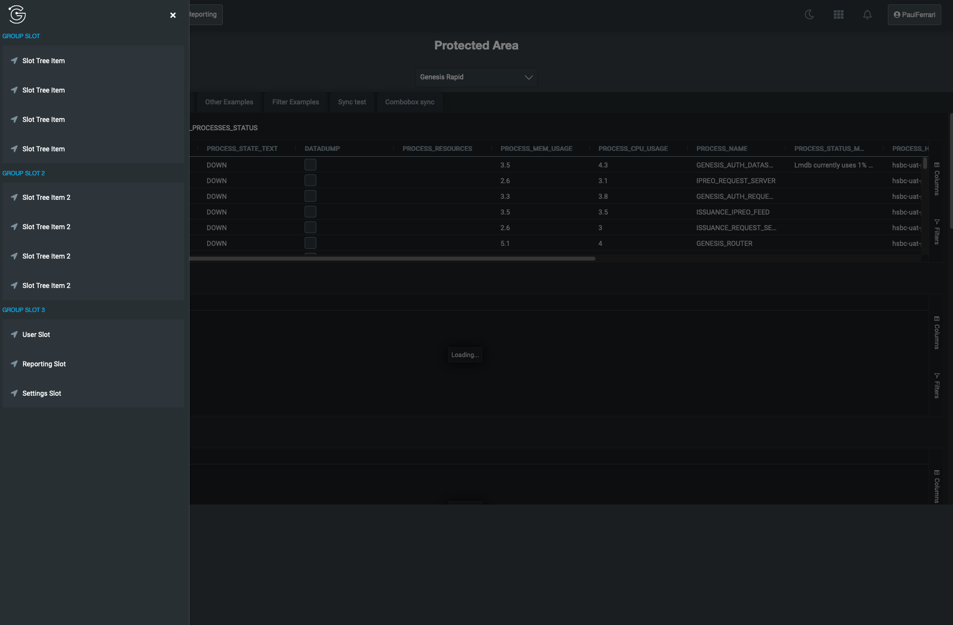
To set the content of the flyout menu, add the content in the html within an element that has the slot="menu-contents" attribute.
<foundation-header>
          ....
  <div slot="menu-contents">
    <p>GROUP SLOT</p>
    <zero-tree-view>
      <zero-tree-item>
        <zero-icon variant="solid" name="location-arrow"></zero-icon>
        Slot Tree Item
      </zero-tree-item>
      <zero-tree-item>
        <zero-icon variant="solid" name="location-arrow"></zero-icon>
        Slot Tree Item
      </zero-tree-item>
    </zero-tree-view>
    <p>GROUP SLOT 2</p>
    <zero-tree-view>
      <zero-tree-item>
        <zero-icon variant="solid" name="location-arrow"></zero-icon>
        Slot Tree Item 2
      </zero-tree-item>
      <zero-tree-item>
        <zero-icon variant="solid" name="location-arrow"></zero-icon>
        Slot Tree Item 2
      </zero-tree-item>
    </zero-tree-view>
  </div>
      ...
</foundation-header>
Exercise 1.3: adding items to the flyout menu
10 min
Add an item pointing to the playground page.
Look at the interaction components to see a list of available components you can use for the menu item. A good suggestion would be adding the @click attribute to the <zero-tree-item>.
  <zero-tree-item @click=${(x) => x.navigation.navigateTo("<YOUR_PATH_TO_PLAYGROUD>")}>
    <zero-icon variant="solid" name="location-arrow"></zero-icon>
    Playground
    </zero-tree-item>
  <zero-tree-item>
By the way, we're using by default the Zero Design Systems. We are going to talk more about Design Systems later in this course.
Exercise 1.4: adding new routes
30 min
Customise our header in such a way that we end up with these menu items:
| Menu item | Route |
|---|---|
| Trades & Positions | home |
| Playground | playground |
| Orders | order |
| Reporting | report |
Feel free to display only empty content when you create the new pages (Orders and Reporting). We're just interested in the navigation for now.
Use the pattern of creating a .template.ts, .styles.ts and .ts files for each component.
Also, make sure to configure client/web/src/main/main.ts and client/web/src/routes/config.ts accordingly.