Web Developer training - Day three
This day covers:
Order entry screen
Let's continue the development of the order screen.
Grid interaction
To add new columns that are not part of the resource model (ALL_ORDERS query in this case), we can add additional column definitions.
...
export const OrderTemplate = html<Order>`
  ...
<zero-grid-pro>
    <grid-pro-genesis-datasource
            resource-name="ALL_ORDERS"
            order-by="ORDER_ID">
    </grid-pro-genesis-datasource>
    <grid-pro-column :definition="${x => x.singleOrderActionColDef}" />
</zero-grid-pro>
  ...
`;
In the component definition file, we can provide a method that enables us to interact with the rest of the class. The example below creates a column with a button that logs data in the row to the console. Here you can easily swap logging the row data with some custom logic (such as calling a back-end API that we shall cover in more detail later on).
...
export class Order extends FASTElement {
  ...
  public singleOrderActionColDef = {
    headerName: 'Action',
    minWidth: 150,
    maxWidth: 150,
    cellRenderer: 'action',
    cellRendererParams: {
      actionClick: async (rowData) => {
        console.log(rowData);
      },
      actionName: 'Print Order',
      appearance: 'primary-gradient',
    },
    pinned: 'right',
  };
}
Find out more about:
Custom column config
If you want to customise how each column is displayed, you can provide column config for every column.
Create a new file called orderColumnDefs.ts in the same directory.
import {ColDef} from '@ag-grid-community/core';
import {formatNumber} from '../../utils/formatting';

export const orderColumnDefs: ColDef[] = [
    {field: 'INSTRUMENT_ID', headerName: 'Instrument', sort: 'desc', flex: 2},
    {field: 'QUANTITY', headerName: 'Quantity', valueFormatter: formatNumber(0), type: 'rightAligned', flex: 1, enableCellChangeFlash: true},
    {field: 'ORDER_ID', headerName: 'Order ID', flex: 1, enableCellChangeFlash: true},
    {field: 'PRICE', headerName: 'Price', valueFormatter: formatNumber(2), type: 'rightAligned', flex: 1, enableCellChangeFlash: true},
    {field: 'DIRECTION', headerName: 'Order Side', sort: 'desc', flex: 2},
    {field: 'NOTES', headerName: 'Notes', sort: 'desc', flex: 2},

];
To stop automatic generation of columns, you need to add the only-template-col-defs attribute to the zero-grid-pro.
Then use the repeat directive; this includes all the columns from our column config array.
...
import {orderColumnDefs} from './orderColumnDefs';
...
export const OrderTemplate = html<Order>`
...
<zero-grid-pro only-template-col-defs >
<grid-pro-genesis-datasource
resource-name="ALL_ORDERS"
order-by="ORDER_ID">
</grid-pro-genesis-datasource>
${repeat(() => orderColumnDefs, html`
`)}
<grid-pro-column :definition="${x => x.singleOrderActionColDef}" />
</zero-grid-pro>
...
`;
Saving user preferences
You can add the persist-column-state-key to the zero-grid-pro to persist user changes to things such as sorting, column order, and visibility on their machine. With this, when the user reloads the browser, they get the same configuration.
<zero-grid-pro
    persist-column-state-key='order-grid-settings'
>
Exercise 3.1: getting familiar with Genesis grid-pro attributes
15min
Change the row height of the data grid to '20 px'.
You can find all the additional attributes and props, including row height, of the Genesis grid-pro at Genesis grid-pro documentation.
Exercise 3.2: adding CANCEL action column
40min
Add a new action column called 'Cancel' that calls EVENT_ORDER_CANCEL event handler. If an error is returned by the Event, make sure to display an error message.
Note that the event will actually delete the order.
If you struggle, make sure to revisit this previous lesson on calling event handlers.
An example of own grid component
It's possible to create your own grid component if you want something completely customized. We can do that creating a new customElement.
In the example below, the component is called positions-grid-pro. Go to the folder components and create a new folder called "order-grid". We are going to create our brand new component there.
import {ZeroGridPro, zeroGridProTemplate} from '@genesislcap/foundation-zero-grid-pro';
import {customElement} from '@microsoft/fast-element';
import {positionsGridStyles} from './grid-pro.styles';

@customElement({
  name: 'positions-grid-pro',
  template: zeroGridProTemplate,
  styles: positionsGridStyles,
})
export class PositionsAgGrid extends ZeroGridPro {
}
Note we are extending ZeroGridPro, not FASTElement.
Now you need to provide custom styles for the custom component:
import {zeroAgGridStyles} from '@genesislcap/foundation-zero';
import {css, ElementStyles} from '@microsoft/fast-element';
import {BUY_SIDE, SELL_SIDE, NEW_TRADE_STATUS, CANCELLED_TRADE_STATUS} from './colors';

export const positionsAgGridStyles: ElementStyles = css`
  ${zeroAgGridStyles}

  .status-cell {
    display:flex;
    align-items: center;
    margin-left: 6px;
  }

  .status-cell::after {
    content: "";
    position: absolute;
    left: 6px;
    height: 100%;
    width: 3px;
  }

  .buy-side-trade.status-cell::after {
    background-color: ${BUY_SIDE};
  }

  .buy-side-trade {
    color: ${BUY_SIDE};
  }

  .sell-side-trade.status-cell::after {
    background-color: ${SELL_SIDE};
  }

  .sell-side-trade {
    color: ${SELL_SIDE};
  }

  .new-status-trade.status-cell::after {
    background-color: ${NEW_TRADE_STATUS};
  }

  .new-status-trade {
    color: ${NEW_TRADE_STATUS};
  }

  .cancel-status-trade.status-cell::after {
    background-color: ${CANCELLED_TRADE_STATUS};
  }

  .cancel-status-trade {
    color: ${CANCELLED_TRADE_STATUS};
  }
`;
This allows us to enhance the column definitions by adding conditional classes:
const tradeCellClassRules = {
  'buy-side-trade': params => params.value === 'BUY',
  'sell-side-trade': params => params.value === 'SELL',
  'new-status-trade': params => params.value === 'NEW',
  'cancel-status-trade': params => params.value === 'CANCELLED',
};

export const tradeColumnDefs: ColDef[] = [
  {field: 'INSTRUMENT_NAME', headerName: 'Instrument', enableCellChangeFlash: true, flex: 3},
  {field: 'SIDE', headerName: 'Side', cellClass: 'status-cell', cellClassRules: tradeCellClassRules, enableCellChangeFlash: true, flex: 1},
  {field: 'QUANTITY', headerName: 'Quantity', valueFormatter: formatNumber(0), type: 'rightAligned', enableCellChangeFlash: true, flex: 1},
  {field: 'CURRENCY', headerName: 'Ccy', enableCellChangeFlash: true, flex: 1},
  {field: 'PRICE', headerName: 'Price', valueFormatter: formatNumber(2), type: 'rightAligned', enableCellChangeFlash: true, flex: 2},
  {field: 'CONSIDERATION', headerName: 'Consideration', valueFormatter: formatNumber(2), type: 'rightAligned', enableCellChangeFlash: true, flex: 2},
  {field: 'TRADE_DATETIME', headerName: 'Date', valueFormatter: rowData => formatDateLong(rowData.data.TRADE_DATETIME), sort: 'desc', enableCellChangeFlash: true, flex: 2},
  {field: 'COUNTERPARTY_NAME', headerName: 'Counterparty', enableCellChangeFlash: true, flex: 2},
  {field: 'TRADE_STATUS', headerName: 'Trade State', cellClass: 'status-cell', cellClassRules: tradeCellClassRules, enableCellChangeFlash: true, flex: 2},
  {field: 'ENTERED_BY', headerName: 'Entered By', enableCellChangeFlash: true, flex: 2},
];
Final result
And so we have our result:
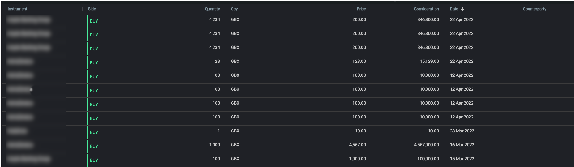
Looks good, doesn't it?
Exercise 3.3: extending Grid Pro
45min
Create a new component called OrdersAgGrid extending ZeroGridPro. Apply the same style on the SIDE field of the PositionsAgGrid in the OrdersAgGrid - so that SIDE will be green when BUY and red when SELL.
To do this, remember to create an order-grid folder below client\web\src\components and create the files needed to create a class, template and styles (e.g. order-grid.ts, order-grid.template.ts and order-grid.styles.ts). Apply the necessary changes that we saw above.
Finally, create a new route called custom-order (as we did with playground, order, etc) and then add the order-grid you just created.
Adding filters to the Orders data grid
The way we have been using grid-pro so far is encapsulating a Genesis datasource to have access to Data Server resources. This makes it easier to retrieve data without worrying about the connection, handling update events and so on. This is called connected data.
Genesis datasource offers some attributes to parameterise how to retrieve the data. Some commonly used attributes are:
-
criteria: string: a Groovy expression to perform filters on the query server; these remain active for the life of the subscription. For example: Expr.dateIsBefore(TRADE_DATE,'20150518') or QUANTITY > 10000. -
order-by: string: This option can be used to select a Data Server index (defined in tables-dictionary.kts), which is especially useful if you want the data to be sorted in a specific way. By default, data server rows will be returned in order of creation (from oldest database record to newest). -
resource-name: string: The target Data Server or Request Server name. Example: "ALL_TRADES" or "ALT_COUNTERPARTY_ID"
As you may have noticed, we've already used resource-name and order-by when we used the grid-pro-genesis-datasource for the first time.
Now, let's see how we'd use criteria to add some filters to the data grid. In the example below, only orders whose side is BUY would be displayed:
<grid-pro-genesis-datasource
    resource-name="ALL_ORDERS"
    order-by="ORDER_ID"
    criteria="DIRECTION == 'BUY'"
>
</grid-pro-genesis-datasource>
Having a static filter like that is not always very useful though. Let's make it more dynamic adding a button in the order screen to filter by side and make the criteria read the side to be filtered dynamically:
<zero-button @click=${x=> x.toggleSideFilter()}>Toggle SIDE filter</zero-button>

<grid-pro-genesis-datasource
        resource-name="ALL_ORDERS"
        order-by="ORDER_ID"
        criteria="DIRECTION == '${x=>x.sideFilter}'">
</grid-pro-genesis-datasource>
import {customElement, FASTElement, observable, attr } from '@microsoft/fast-element';
...
@attr public sideFilter = 'BUY';

public toggleSideFilter() {
    this.sideFilter = this.sideFilter == 'BUY' ? 'SELL' : 'BUY';
}
Make sure to try it now and click on the 'Toggle SIDE filter' button to see the filter being applied.
Ultimately, we can use something like the ref directive to make our code completely override the criteria. So, let's add another button to reset the criteria to something else and use the ref in grid-pro-genesis-datasource.
import {html, repeat, when, ref} from '@microsoft/fast-element';

...

<zero-button @click=${x=> x.customFilter()}>No filters</zero-button>

...

<grid-pro-genesis-datasource ${ref('ordersGrid')}
        resource-name="ALL_ORDERS"
        order-by="ORDER_ID"
        criteria="DIRECTION == '${x=>x.sideFilter}'">
    </grid-pro-genesis-datasource>
Add the ordersGrid property and customFilter method to the Order class:
@observable ordersGrid: any;

public customFilter() {
    this.ordersGrid.criteria = `DIRECTION == 'BUY' || DIRECTION == 'SELL'`;
  }
As you can see, there's a reference in the Order class to the grid-pro-genesis-datasource element called ordersGrid and we can set its attributes, such as the criteria attribute, to any value we want.
Data server client-side options
It's also possible to add those attributes, such as criteria and orderBy (with slightly different naming conventions), to the Connect object from Foundation Comms. See example below:
// retrieving access type of currently logged-in user
const userReq = await this.connect.snapshot('ALL_USERS', {
    CRITERIA_MATCH: `USER_NAME == '${this.session.getItem('username')}'`,
});
To see a list of all attributes look at Data server client-side options.
As a side note, the code above also tells us how to retrieve the current logged-in user from the session, which is actually stored in the local storage of the browser.
To find out more, inspect the Local Storage of your browser to see all the data that is being stored. In Chrome, press F12 to open DevTools, then go to Application -> Storage -> Local Storage -> http://localhost:6060/.
Exercise 3.4: using criteria
20min
Add a new field minimumQuantity that the user can enter the minimum quantity of an order to be displayed in the grid. I.e., filter orders by a minimum quantity entered by the user.