Web Developer training - Day four
This day covers:
Styling
You might want to customise look and feel using layout and styles. For instance, we can style an grid-pro or even a layout that supports responsive web design.
grid-pro
We've seen how to create custom grids, now let's see a way to style it further.
Styling a grid-pro can be started by creating a stylesheet document that will have some style definitions for the grid. Create a stylesheet file called orders-grid.styles.ts and provide the following code:
import {css, ElementStyles} from '@microsoft/fast-element';

export const ordersGridStyles: ElementStyles = css`
    .notes-column {
        color: blue;
    }
`
Configure your column to have the specific class name:
{field: 'NOTES', headerName: 'Notes', sort: 'desc', cellClass: 'notes-column', flex: 2},
In order.template.ts, in the grid tag, include a utility that will inject your stylesheet to the component:
import {ordersGridStyles} from "./orders-grid.styles";

...

<zero-grid-pro>
    ...
    <slotted-styles :styles=${() => ordersGridStyles}></slotted-styles>
    ...
</zero-grid-pro>
`
If you need to provide different class names for specific conditions, you can provide a function to the cellClass column config, as shown in the example below:
{field: 'DIRECTION', headerName: 'Order Side', cellClass: (params) => params.value === 'BUY' ? 'buy-direction' : 'sell-direction', sort: 'desc', flex: 2},
Remember to add the new styles to your stylesheet file.
import {css, ElementStyles} from '@microsoft/fast-element';

export const ordersGridStyles: ElementStyles = css`
.notes-column {
  color: blue;
}

.buy-direction {
  color: green;
}

.sell-direction {
  color: red;
}
`
Layout
By default, all elements on screen use display:block, but we can easily customise it using our custom component that supports responsive web design.
<foundation-flex-layout class="flex-row flex-sm-column spacing-2x">
    <!--content-->
</foundation-flex-layout>
For further styling your components, it would make sense to start working with Design Systems, which is our next topic.
Exercise 4.1 Styling a Grid-Pro
20 mins
Style the quantity field of the orders grid so that if the value is bigger than 100 it will be in green, otherwise red.
Here you can use specific conditions providing a function to the cellClass column config.
Dynamic layout
The aim of this section is to implement the foundation-layout component, which allows the user to drag, drop, resize, maximise, and restore windows.
Refactor orders.ts
In order to prevent the components becoming excessivly large, we need to refactor the orders.ts.
Before we add the dynamic layout this is a good time to refactor the four components inside home.ts we've built into their own components. This will help stop the components getting excessively large.
Refactoring out the components is also required here due to a limitation with the cloneNode() API and how it interacts with FAST bindings and event listeners. A clean way to solve this issue is to wrap up your layout contents into individual components as we are about to do.
If your components were interacting with each other via the parent component then it is
recommended to change them to interact via the foundation-store utility.
Orders grid
We'll start with the most straightforward component. Create a directory called orders-grid in the orders folder and add these two files to it:
import { customElement, FASTElement, observable, attr } from '@microsoft/fast-element';
import { ordersGridTemplate } from './orders-grid.template';
import { Connect } from '@genesislcap/foundation-comms';

@customElement({
  name: 'orders-grid',
  template: ordersGridTemplate
})

export class OrdersGrid extends FASTElement {

    @Connect connect: Connect;
    @observable public instrument: string;
    @observable public lastPrice: number;
    @observable public quantity: number;
    @observable public price: number;
    @observable public direction: string;
    @observable public notes: string;
    @observable public serverResponse;
    @observable public instrumentClass: string;
    @observable public quantityClass: string;
    @observable public priceClass: string;
    @attr public Order_ID = Date.now();
    @attr public minimumQuantity: number;
    @attr public sideFilter = 'BUY';


    public singleOrderActionColDef = {
        headerName: 'Action',
        minWidth: 150,
        maxWidth: 150,
        cellRenderer: 'action',
        cellRendererParams: {
          actionClick: async (rowData) => {
            console.log(rowData);
          },
          actionName: 'Print Order',
          appearance: 'primary-gradient',
        },
        pinned: 'right',
        };

        public cancelOrderActionColDef = {
            headerName: 'Cancel',
            minWidth: 150,
            maxWidth: 150,
            cellRenderer: 'action',
            cellRendererParams: {
              actionClick: async (rowData) => {
                this.serverResponse = await this.connect.commitEvent('EVENT_ORDER_CANCEL', {
                  DETAILS: {
                    ORDER_ID: rowData.ORDER_ID,
                    INSTRUMENT_ID: rowData.INSTRUMENT_ID,
                    QUANTITY: rowData.QUANTITY,
                    PRICE: rowData.PRICE,
                    DIRECTION: rowData.direction,
                    NOTES: rowData.NOTES,
                  },
                });
            console.log(this.serverResponse);

            if (this.serverResponse.MESSAGE_TYPE == 'EVENT_NACK') {
              const errorMsg = this.serverResponse.ERROR[0].TEXT;
              alert(errorMsg);
            } else {
              alert('Order canceled successfully.');
            }
          },
          actionName: 'Cancel Order',
          appearance: 'primary-gradient',
        },
        pinned: 'right',
    };

}
Insert trade form
And now we refactor out the form. This is slightly different because we need an associated styles file too. Create an insert-orders-form directory and add these three files:
import { Connect } from '@genesislcap/foundation-comms';
import {customElement, FASTElement, observable, attr } from '@microsoft/fast-element';
import { insertOrdersFormStyles } from './insert-orders-form.styles';
import { insertOrdersFormTemplate } from './insert-orders-form.template';

@customElement({
  name: 'insert-orders-form',
  template: insertOrdersFormTemplate,
  styles: insertOrdersFormStyles,
})


export class InsertOrdersForm extends FASTElement {
    @Connect connect: Connect;
    @observable public instrument: string;
    @observable public lastPrice: number;
    @observable public quantity: number;
    @observable public price: number;
    @observable public direction: string;
    @observable public notes: string;
    @observable public allInstruments: Array<{value: string, label: string}>; //add this property
    @observable public directionOptions: Array<{value: string, label: string}>; //add this property
    @observable public serverResponse;
    @observable public instrumentClass: string;
    @observable public quantityClass: string;
    @observable public priceClass: string;

    @attr public Order_ID = Date.now();
    @attr public minimumQuantity: number;
    @attr public sideFilter = 'BUY';

    public async getMarketData() {
          const msg = await this.connect.request('INSTRUMENT_MARKET_DATA', {
            REQUEST: {
              INSTRUMENT_ID: this.instrument,
            }});
          console.log(msg);

          this.lastPrice = msg.REPLY[0].LAST_PRICE;
        }

    @observable tradeInstruments: Array<{ value: string; label: string }>;

    public async connectedCallback() { //add this method to Order class
        super.connectedCallback(); //FASTElement implementation

        const msg = await this.connect.snapshot('ALL_INSTRUMENTS'); //get a snapshot of data from ALL_INSTRUMENTS data server
        console.log(msg); //add this to look into the data returned and understand its structure
        this.allInstruments = msg.ROW?.map(instrument => ({
          value: instrument.INSTRUMENT_ID, label: instrument.INSTRUMENT_NAME}));
        const metadata = await this.connect.getMetadata('ALL_ORDERS');
        console.log(metadata);
        const directionField = metadata.FIELD?.find(field => field.NAME == 'DIRECTION');
        this.directionOptions = Array.from(directionField.VALID_VALUES).map(v => ({value: v, label: v}));
    }

    public async insertOrder() {

        this.Order_ID = Date.now();
        this.instrumentClass = "";
        this.quantityClass = "";
        this.priceClass = "";

        this.serverResponse = await this.connect.commitEvent('EVENT_ORDER_INSERT', {
            DETAILS: {
                ORDER_ID: this.Order_ID,
                INSTRUMENT_ID: this.instrument,
                QUANTITY: this.quantity,
                PRICE: this.price,
                DIRECTION: this.direction,
                NOTES: this.notes,
            },
        });
        console.log("serverResponse: ", this.serverResponse);

        if (this.serverResponse.MESSAGE_TYPE == 'EVENT_NACK') {
            const error = this.serverResponse.ERROR[0];
            alert(error.TEXT);
            switch (error.FIELD) {
                case "INSTRUMENT_ID":
                  this.instrumentClass = 'required-yes';
                  break;

                case "QUANTITY":
                  this.quantityClass = 'required-yes';
                  break;

                case "PRICE":
                  this.priceClass = 'required-yes';
                  break;

                default:
                  console.log("FIELD not found: ", error.FIELD);
            }
        }
    }
}
import { sync } from '@genesislcap/foundation-utils';
import { html, repeat, when } from '@microsoft/fast-element';
import { InsertOrdersForm } from './insert-orders-form';
export const insertOrdersFormTemplate = html<InsertOrdersForm>`
<template>
<div class = "column-split-layout">
<zero-anchor disabled appearance="accent">Order_ID - ${x => x.Order_ID}</zero-anchor>
<span class='${x => x.instrumentClass}'>Instrument</span>
<zero-select :value=${sync(x=> x.instrument)} @change=${x => x.getMarketData()} position="below">
<zero-option :selected=${sync(x => x.instrument==undefined)}>-- Select --</zero-option>
${repeat(x => x.allInstruments, html`
`)}
</zero-select>
<span>Last price: ${x => x.lastPrice}</span>
<zero-text-field required :value=${sync(x=> x.quantity)} :class='${x => x.quantityClass}'>Quantity</zero-text-field>
<zero-text-field :value=${sync(x=> x.price)} class='${x => x.priceClass}'>Price</zero-text-field>
<span>Total: ${x => x.quantity * x.price}</span>
<span>Direction</span>
<zero-select :value=${sync(x=> x.direction)}>
${repeat(x => x.directionOptions, html`
`)}
</zero-select>
<zero-text-area :value=${sync(x=> x.notes)}>Notes</zero-text-area>
<zero-button @click=${x=> x.insertOrder()}>Add Order</zero-button>
${when(x => x.serverResponse, html`
`)}
</div>
</template>
`
and finally:
import {css, ElementStyles} from "@microsoft/fast-element";
import { mixinScreen } from '../../../styles';

export const insertOrdersFormStyles = css`
  :host {
    ${mixinScreen('flex')}
    justify-content: top;
    flex-direction: column;
    display: block;
  }

  .required-yes {
    color: red;
  }

  .column-split-layout {
    margin-up: 5%;
    display: flex;
    flex-direction: column;
    border-style: solid;
    vertical-align: center;

  }

  span, zero-select {
  display: block;
  }

`;
Add the layout to the order template
Now we have refactored our two components, it is easy to add the dynamic layout. Change the order.template.ts to:
import {html, repeat, when, ref } from '@microsoft/fast-element';
import type {Order } from './order';
import { sync } from '@genesislcap/foundation-utils';
import { OrderStyles } from './order.styles';
import { positionGridStyles } from "./positionsGrid.styles";
import { orderColumnDefs } from './orderColumnDefs';
import { ordersGridStyles } from "./orders-grid.styles";
import { InsertOrdersForm } from './insert-orders-form/insert-orders-form';
import { OrdersGrid } from './orders-grid/orders-grid';

InsertOrdersForm;
OrdersGrid;

export const OrderTemplate = html<Order>`
  <zero-layout>
    <zero-layout-region type="horizontal">
      <zero-layout-region type="vertical">
        <zero-layout-item title="Orders Grid">
            <orders-grid></orders-grid>
        </zero-layout-item>
      </zero-layout-region>
      <zero-layout-region type="vertical">
        <zero-layout-item title="Orders Form">
            <insert-orders-form></insert-orders-form>>
        </zero-layout-item>
      </zero-layout-region>
    </zero-layout-region>
  </zero-layout>
`
Understanding the layout
As you noticed, the <zero-layout> has two main components that control the layout of the page.
<zero-layout-region>divides the layout of the page equally depending on its type. Iftype= horizontal, then the layout will be split horizontally; iftype= vertical, then the layout will be split vertically. The layout is split equally, depending on the number of items you insert between the<zero-layout-region></zero-layout-region>to the application.zero-layout-itemstores the content of each region of the page.
Exercise 4.2 insert a new grid
20 mins
Insert the ALL_INSTRUMENTS grid in the orders page. Place it on the top right of the page.
You can directly insert the new grid into the order.template.ts, but it is recommended to create a new component called positions-grid and follow the previous steps. This enables you to maintain your order.template.ts as clear as possible.
Now we are going to look at some of the dynamic interactions that are available via the layout's JavaScript API. In this example, we are going to:
- set up the component to autosave the layout as the user interacts with it
- add a button to reset the layout
To see what else you can do with the JavaScript API, see the main documentation in the API documentation.
Autosaving layout
It is easy to get the layout to autosave as the user changes it. Add a key under the auto-save-key attribute and the layout will take care of the rest. Ensure that the key you use is unique, so it doesn't clash with any other saved layouts.
Add this attribute to your order.template.ts:
<zero-layout auto-save-key="training-layout-key">
	<zero-layout-region type="horizontal">
		<!-- other layout contents -->
	</zero-layout-region>
</zero-layout>
Now when you're on the page, if you make a change to the layout (resize, drag, reorder, add/remove items), then the layout will be saved in local storage.
Try for yourself! drag an item around and refresh the page and see it reload your layout.
The layout-saving functionality is only responsible for the layout itself - it will not save the state of the items inside it. Components are responsible for saving their own state if required - such as the grids you set up in the basics tutorial.
Resetting the layout
The user's layout is now saved, now we need to create a reset button.Now we are going to create this button.
The first thing we want to do is to update the Order component with a reference to the layout.
import { ... , ref } from '@microsoft/fast-element';
<zero-layout auto-save-key="tutorial-app-layout-key" ${ref('layout')}>
	<zero-layout-region type="horizontal">
		<!-- other layout contents -->
	</zero-layout-region>
</zero-layout>
import {customElement, FASTElement, observable, attr } from '@microsoft/fast-element';
import {OrderTemplate as template} from './order.template';
import {OrderStyles as styles} from './order.styles';
import {Connect} from '@genesislcap/foundation-comms';
import {logger} from '../../utils';
import { FoundationLayout } from '@genesislcap/foundation-layout';

const name = 'order-route';

@customElement({
  name,
  template,
  styles,
})

export class Order extends FASTElement {
  layout: FoundationLayout;
Updating the header
Next, we want to add a button to the header sidebar to reset the layout. In this seed, the header is defined in a file called default.ts.
    <div class="container">
      <foundation-header
        show-luminance-toggle-button
        show-misc-toggle-button
        show-notification-button>
		<!-- other header contents -->
		<div slot="menu-contents">
			<zero-button
				appearance="neutral-grey"
				@click=${(x, _) => {
					const { resetLayout } = x.lastChild;
					resetLayout();
				}}
			>
				Reset Layout
			</zero-button>
		</div>
		<!-- other header contents -->
	</foundation-header>
	<div class="content">
		<slot></slot>
	</div>
</div>
When you load the app, you can now click the hamburger menu in the top-left corner and see the reset button. Clicking it will execute the resetLayout() function in the order.ts file; but we still need to set up the actual functionality.
If you've changed the structure of your application from the default, you might not be able to access Home via x.lastChild like we did in the click handler. You may need to experiment with getting a reference to the Home yourself, use events, or the Foundation Store.
Reload the default
Finally we can now make resetLayout() load the default layout. The easiest way to get the default layout configuration is using the developer tools on your web browser. Open the developer tools in your browser and find the layout component (remember that we are looking for <zero-layout> in this case).
If you've changed the layout from the default while testing your application, you need to reset it manually back to the default.
- In the developer tools, find the local storage and delete the
foundation-layout-autosavevalue. - Refresh the page.
Now we need access to this component in the web console. In most browsers you can do this by right-clicking on <zero-layout> in the element inspector and selecting an option that is similar to "store in a global variable".
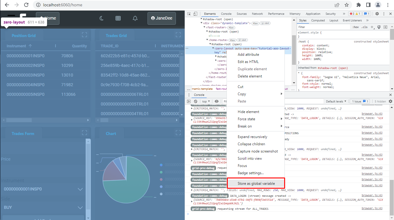
This will save the layout in a variable, such as temp1.
Then, to get to get the layout run this command in the web console:
JSON.stringify(temp1.getLayout()) // temp0, or whatever your browser saved the layout in
You can follow this process to create a range of pre-defined layouts for the user in addition to being able to restore the default layout. Or you can, for example, use the .getLayout() and .loadLayout() APIs to allow the user to save their own layouts.
Now create a file under the order directory called predefined-layouts.ts; copy the generated string and paste it into a file in the project.
export const ORDERS_DEFAULT_LAYOUT = ... /* Set this equal to the string from the web console */
The final step is to wire all of this functionality together so that the button loads the layout that we have just saved.
import { customElement, FASTElement, observable } from '@microsoft/fast-element';
import { HomeTemplate as template } from './home.template';
import { HomeStyles as styles } from './home.styles';
import { Connect } from '@genesislcap/foundation-comms';
import { FoundationLayout } from '@genesislcap/foundation-layout';
import { ORDERS_DEFAULT_LAYOUT } from './predefined-layouts';

const name = 'order-route';

@customElement({
  name,
  template,
  styles,
})
export class Home extends FASTElement {
  layout: FoundationLayout;

  connectedCallback(): void {

    ...

    this.resetLayout = this.resetLayout.bind(this);

    ...
  }

  resetLayout() {
    this.layout.loadLayout(JSON.parse(ORDERS_DEFAULT_LAYOUT));
  }
}
You need to override the existing connectedCallback() method.
Now when you open the header sidebar and click the reset button, you should see the layout return to its default settings.
Chart
Charts is one of the must-have components in any dashboard. Because of that, Genesis created a easy way to add a series of charts into your application. Let's create our brand new chart.
Adding a new chart
The g2plot-chart component is a wrapper for @antv/g2plot, which allows the following types: Line, Area, Bar, Bubble, Column, Pie, Dual Axes, Rose, Scatter.
You can quickly add charts to your application. First we need to create a new component as we did in the previous exercise. Create a folder named orders-chart and add these two files:
import { html } from '@microsoft/fast-element';
import { OrdersChart } from './orders-chart';

export const ordersChartTemplate = html<OrdersChart>`
  <template>
    <zero-g2plot-chart type="pie" :config=${(x) => x.chartConfiguration}>
        <chart-datasource
        resourceName="ALL_ORDERS"
        server-fields="INSTRUMENT_ID QUANTITY"
        isSnapshot
        ></chart-datasource>
    </zero-g2plot-chart>
  </template>
`;
import { customElement, FASTElement, observable } from '@microsoft/fast-element';
import { ordersChartTemplate } from './orders-chart.template';

@customElement({
  name: 'orders-chart',
  template: ordersChartTemplate,
})
export class OrdersChart extends FASTElement {
  @observable chartConfiguration = {
    width: 800,
    angleField: 'value',
    colorField: 'groupBy',
    radius: 0.75,
    label: {
      type: 'spider',
      labelHeight: 28,
      content: '{name}\n{percentage}',
      style: {
        fill: 'white',
      },
    },
    interactions: [{ type: 'element-selected' }, { type: 'element-active' }],
  };
}
For further configuration examples, please see: here.
Your orders.template.ts should be like this:
import type {Order} from './order';
import { OrderStyles} from './order.styles';
import { InsertOrdersForm } from './insert-orders-form/insert-orders-form';
import { OrdersGrid } from './orders-grid/orders-grid';
import { InstrumentsGrid } from './instruments-grid/instruments-grid';
import { OrdersChart } from './orders-chart/orders-chart';

InsertOrdersForm;
OrdersGrid;
InstrumentsGrid;
OrdersChart;


export const OrderTemplate = html<Order>`
  <zero-layout>
    <zero-layout-region type="horizontal">
      <zero-layout-region type="vertical">
        <zero-layout-item title="Orders Grid">
            <orders-grid></orders-grid>
        </zero-layout-item>
        <zero-layout-item title="Orders Grid">
            <instruments-grid></instruments-grid>
        </zero-layout-item>
      </zero-layout-region>
      <zero-layout-region type="vertical">
        <zero-layout-item title="Orders Form">
            <insert-orders-form></insert-orders-form>>
        </zero-layout-item>
        <zero-layout-item title="Orders Chart">
            <orders-chart></orders-chart>
        </zero-layout-item>
      </zero-layout-region>
    </zero-layout-region>
  </zero-layout>
`
Now you should play aound with the properties of the chart, so you get used to it.
Design systems
A design system is a collection of resources for interactive media that promotes brand alignment of UX assets, Design tokens, Component library, and Documentation.
The Genesis design system implementation provides the elements listed above, as well as a few additional features, such as:
- set of reusable UI components
- configuration files which allow you to control colours, typography, sizing and various other aspects
- building blocks for creating your own custom components on top of the design system
When you generate a design system using the Genesis scaffolding CLI tool GenX it will automatically extend a base design system that we have provided. This highly configurable design system is called Genesis Foundation UI. Our design system starts in Axure and has been lab-tested to meet the needs of financial markets.
Design systems are highly configurable and can be shared across multiple applications. When performing customisations, you can control the scope as follows:
- Customisation (general) - applied to the design system itself, affecting all applications that use the system.
- Customisation (app-specific) - this is only applied to a single application. Other applications using the same system are not affected.
Customisation (general)
The starting point for making general customisations is the src/_config folder:
alpha-design-system
├── dist
├── node_modules
├── src
│   ├── _config
│   │   ├── styles
│   │   │   ├── colors.ts
│   │   │   └── index.ts
│   │   ├── tokens
│   │   │   ├── custom.ts
│   │   │   ├── default.ts
│   │   │   └── index.ts
│   │   ├── values
│   │   │   ├── color.ts
│   │   │   ├── index.ts
│   │   │   ├── misc.ts
│   │   │   ├── sizing.ts
│   │   │   └── typography.ts
│   │   └── index.ts
It contains configuration files that set default values for various design tokens, as well as a few other settings. You can achieve major visual changes simply by modifying token defaults. There are several categories of token available:
- Colour: base colours, dark/light mode, colour variants for interactive states (hover etc.)
- Typography: default font family, font size and line height hierarchy
- Sizing: component sizing, spacing and border style
- Miscellaneous: other configuration options, such as the naming prefix (e.g.
alpha)
To help you visualise how modifying tokens impacts the component look and feel, we offer a live configuration preview.
To go beyond adjusting token values, you can override the default component implementation. You can choose only to override certain aspects of a component (such as template, styles or shadow DOM options) or provide a completely custom implementation. By default, components in your design simply re-export components from the underlying foundation design system as is (exact code can vary):
import {foundationButton} from '@genesislcap/foundation-ui';

export const alphaButton = () => foundationButton();
Instead of re-exporting the default, you can provide your own custom implementation:
import {css, FoundationElement, FoundationElementDefinition, html} from '@genesislcap/foundation-ui';

export const styles = css`
/* CSS  */
`;

export const template = html<AlphaButton>`
/* Template */
`;

interface ButtonDefinition extends FoundationElementDefinition {
  /* Any properties */
}

export class Button extends FoundationElement {
  /* Any custom logic */
}

export const alphaButton = Button.compose<ButtonDefinition>({
  baseName: 'button',
  template,
  styles
});
Customisation (app-specific)
In the Customisation (app-specific) you can also choose to customise either all the components or only individual ones.
Customising all components
When you register a design system in an application, there are several configuration options that affect all the components provided by that design system.
You can override the default prefix set in the _config folder for a specific application as follows:
import { alphaButton, provideDesignSystem } from '@genesislcap/alpha-design-system';

provideDesignSystem()
    .withPrefix('custom')
    .register(alphaButton())
The element can then be used in HTML using the custom prefix:
<custom-button>Button</custom-button>
You can also override the default shadow root mode (typically open, as that is both recommended and the default). You can choose to close all shadow roots by default using withShadowRootMode():
provideDesignSystem()
    .withShadowRootMode('closed')
    .register(/* ... */)
As a best practice, one should try to avoid registering the same component more than once. If your architecture makes this difficult or impossible, you can provide a custom callback to handle disambiguating the duplicate elements. Further details can be found here.
Customising individual components
The APIs described above impact all components, but those options can also be configured or overridden on a per-component basis. Configuring the component itself takes priority over any design system configuration.
The prefix for a component can be configured for a component registration by providing a configuration object with a prefix field during registration:
provideDesignSystem()
    .register(
        alphaButton({ prefix: 'custom' })
    );
To use a custom template for a component, provide a template field to the configuration object during registration:
provideDesignSystem()
    .register(
        alphaButton({
            template: html`
                <p>A completely new template</p>
            `
        })
    )
Styles for a component can be configured as well, by providing a styles field to the configuration object during registration:
provideDesignSystem()
    .register(
        alphaButton({
            styles: css`
                /* completely replace the original styles */
            `
        })
    )
You can also use this technique to extend the existing styles; call the style function to import the originals and compose those with new styles. Here's what that would look like:
provideDesignSystem()
    .register(
        alphaButton({
            styles: (ctx, def) => css`
                ${buttonStyles(ctx, def)}
                /* add your style augmentations here */
            `
        })
    )
Shadow options can be configured as well, including both shadow root mode and focus delegation:
provideDesignSystem()
    .register(
        alphaButton({
            shadowOptions: {
                mode: 'closed',
                delegatesFocus: true
            }
        })
    );
For more information on shadow options, see Element.attachShadow().
You can register your own design system to make your app(s) look and feel cohesive across the organization, following your company design guidelines.
Other developers will simply reuse the same design system.
Design System Configurator
The Design System Configurator (DSC) allows you to personalise and adjust the design system to suit your particular requirements.
To the left, you'll find the Editor, which gives you the freedom to make any desired modifications. On the right, the Preview displays the outcomes of those adjustments.
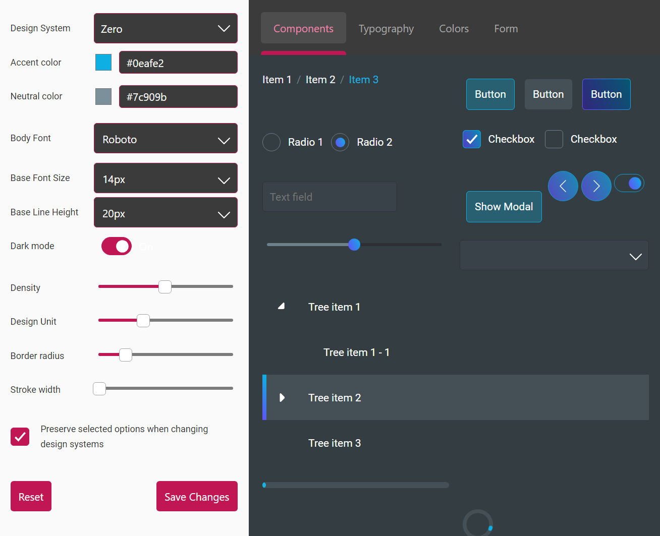
Experiment with adjusting the configurations and observe the corresponding changes on the right side. To use the Web Developer Training starting repository that you cloned here:
- Launch the DSC.
- Customise the look and feel, then click on Save Changes.
- Copy the text from the pop-up CSS, and replace the content of the design-tokens.json file.
After reloading, you should see the applied changes.
There is more information about the DSC in the relevant page of our documentation.
Exercise 4.3 Overriding some components using Design System
40 mins
We've been using components from Genesis Zero Design System, such as zero-select, zero-text-field, zero-button and so on.
Override the Zero design system, registering a new style for the zero-button so that its background colour is green.
Additionally, register your own design system called ui-training and a new component <ui-training-text-field> whose font colour is blue. Use this component in the order screen.
Remember, we have already provided you a folder with the main components (client\web\src\ui-training-design-system), so you need to select the required ones and customize them.
To register your own design system name, you have to edit the file client\web\src\ui-training-design-system\provide-design-system.ts and then change the attribute provideDesignSystem.prefix. Thus, the components will get the defined prefix to declare (e.g. ui-training-text-field, ui-training-button, and so on).
Lastly, to keep the best practices and avoid conflicts, always open the system provider tag prior using the design system components like the example below.
<ui-training-design-system-provider>
  <ui-training-text-field required :value=${sync(x=> x.quantity)}>Quantity</ui-training-text-field>
  <ui-training-text-field :value=${sync(x=> x.price)}>Price</ui-training-text-field>
</ui-training-design-system-provider>
Micro front-ends
The Micro-front-end architecture is a design approach in which a front-end app is decomposed into individual, semi-independent micro applications working loosely together. There are re-usable micro-front-ends that can be used by Genesis-powered applications, such as Foundation Header (covered in Day 1), Entity Management (pretty much covered in the Developer Training), User Management, and Front-end reporting.
Let's take a look at the User Management and Reporting micro front-ends.
User Management
The User Management micro front-end is used to manage the users on the front end. Two core components are used to manage the entities grid-pro and form.
User Management is a concrete use case of the Entity Management micro front-end, which is provided as part of foundation-ui.
To enable this micro front-end in your application, follow the steps below:
- Add
@genesislcap/foundation-entity-managementas a dependency in your package.json file. Whenever you change the dependencies of your project, ensure you run the bootstrap command again.
{
  ...
  "dependencies": {
    "@genesislcap/foundation-entity-management": "latest"
  },
  ...
}
- Import and declare the class in the page of the class where you wish to use the user manager. Then add User Management to the template html where required:
// Import
import { Users } from '@genesislcap/foundation-entity-management';

// Declare class
Users;

// Example html with the user management
// You can customise this with additional fields, see further in this documentation
export const AdminTemplate: ViewTemplate = html`
    <user-management></user-management>
`;
You can customise the functionality of User Management through the properties you set in the html. The primary way to configure the User Management functionality is via the columns that are displayed on the grid.
// Default usage, will contain the "default" columns:
//    username, first name, last name, email, last login
// as well as the additional entity and status columns
<user-management></user-management>
The default columns are contained in the UserColumnConfig variable. The Entity and Status columns are always added to the grid.
To configure the columns yourself, set the columns attribute when you define the User Management in the html. You can mix in your custom column config with the default user columns config using the javascript spread operator.
// Custom usage, will contain the "default" columns:
//    username, first name, last name, email, last login
// the custom "userColumns"
// as well as the additional entity and status columns
<user-management :columns=${() => [...UsersColumnConfig, ...userColumns]}>
</user-management>
Further information about User Management API Ref (such as Permissions or persist-column-state-key) can be found here.
Exercise 4.4 Add the User Management into the application
30 mins
Add the User Management into the application. To do that create a new route and add the User Management micro front-end.
Front-end reporting
The Front-end reporting component enables your users to create report specifications, run them, or save them for later use. From the GUI, users can:
- select columns from existing data sources
- save the report with a name and retrieve it for future use
- apply ad hoc filtering to a report
- export the report results to .csv format
Server configuration
This component requires a server-side module to be installed and running. Please access the reporting distribution 7.0.0 and export the files into your .genesis-home directory.
To make data available to users so that they can create reports, you must insert entries into the REPORT_DATASOURCES table. This table determines which data resources can be reported on.
Now import the REPORTING_DATASOURCES.csv into genesis.
The Report Server adds the following metadata services:
- ALL_SAVED_REPORTS (Data Server)
- SAVED_REPORTS (Request Response)
- ALL_REPORT_DATASOURCES (Request Response)
go to your resource deamon and start all processes.
Front-end configuration
To enable this micro front-end in your application, follow the steps below.
- Add
@genesislcap/foundation-reportingas a dependency in your package.json file.
{
  ...
  "dependencies": {
    ...
    "@genesislcap/foundation-reporting": "14.101.1",
  },
  ...
}
- Import the module and in case you haven't done the exercise 2.1 configure the route in your routes config.ts file.
Synchronous example
// Import
import {Reporting} from '@genesislcap/foundation-reporting';

// Routes configure
public configure() {
  ...
  this.routes.map(
    ...
    {path: 'report', element: Reporting, title: 'Report', name: 'report'},
    ...
  );
}
Asynchronous example
// Routes async configure
public async configure() {
  ...
  this.routes.map(
    ...
    {path: 'reporting', element: (await import('@genesislcap/foundation-reporting')).Reporting, title: 'Reporting', name: 'reporting'},
    ...
  );
}
Exercise 4.5 Creating a new ALL_POSITIONS Report
25 mins
Create a new report using the ALL_ORDERS query in the Data Server.